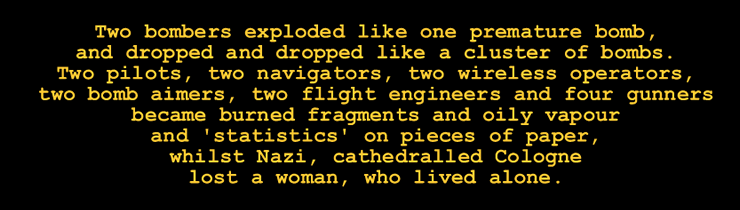
The poem is about the collision of two Lancaster bombers over Cologne. The section The WW2 bombing campaign gives supplementary information about the British bombing offensive against Germany during the Second World War.
For unit poetry, a font is used which, like a typewriter font, is not based on proportional spacing, with characters of variable width. The font used in 'Collision' is a monospaced font, Courier New. In this font, all units are of equal width. The poems in this form were composed on graph paper, initially.
Unit poetry gives the maximum contrast between text and the white space surrounding the text. The white space between words is the absolute minimum. As a result, the impact of the text is increased. Other forms of concrete poetry usually give shape to the poem by increasing the space between words, in other words, by allowing more white space into the text. This may be an intrinsic part of the design or it may lessen the contrast between text and the surrounding white space.
The poem in animated form is typed and then destroyed by an explosion:
'Collision' in its animated form could be considered as a contribution to 'Kinetic Art,' art involving movement, which had its genesis in the Futurist Manifestos of 1909, 1910 and 1912. "In Kinetic Art the composition is not given all at once." (C. Barrett, 'Kinetic Art' in 'Concepts of Modern Art,' edited by Nikos Stangos.) The repeated construction and destruction in 'Collision' could even illustrate Nietzsche's idea of 'the eternal recurrence,' the idea that all events, the worst and most terrible as well as the best, are repeated endlessly. "The idea of eternal recurrence, the highest formula of affirmation that can possibly be attained" (Nietzsche, Ecce Homo, 'Thus Spoke Zarathustra 1) is stated in other places in Nietzsche's writings, for example, 'Beyond Good and Evil,' Section 56 and various sections of 'Thus Spoke Zarathustra' itself. But I don't accept the idea of the eternal recurrence for one moment - who could?
This
in another poem in unit form, 'Level Crossing:'
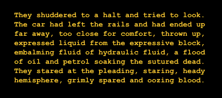
The poem is about a car which is hit by a train and converted into a block of scrap metal. This is a representational unit poem. The poem is a block itself. Each line is exactly 43 units long. I'm conscious that this poem, in Keats's phrase, doesn't make "all disagreeables evaporate." A poet's work as a whole should have this effect but a single poem can show untransformed horror, can express an unrelievedly bleak vision. Besides, the repulsive content of the poem is not all. It's in tension with the serene and harmonious shape of the poem.
The Peruvian poet Cesar
Vallejo's wrote in Poem XXVI of 'Trilce:'
Rehusad, y vosotros, aposar las plantas
en la seguridad dupla de la Armonia.
Rehusad la simetria a buen seguro.
Refuse to place your footsteps
in the double security of Harmony.
Refuse to allow symmetry to
make you sure.
but in my 'symmetrical' poems' I'm doing something unexpected and, I think, well worth doing: using serene, symmetrical shapes in tension with disharmonious content. Mathematicians and scientists take an interest in symmetry. I think poets can take some interest in symmetry too, as an instance of pattern. There's the maximum of tension between the harmonious shape and the bleak and discordant content. This is an aspect of what I call tensile art. In general, in the face of opposites, poetry which is distinctively modern will not reject one of them but will tend to affirm both, often precariously, with great tension. The poets of the past who seem most modern to us have done exactly this: Catullus, for example, with his 'Odi et amo,' 'I hate and love.'
The next unit poem is even more exacting in its form than the previous poems.
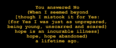
This is a poem in centred rhyme, the first line rhyming with the last, the second line rhyming with the penultimate, and so on. The first line has exactly the same number of units - characters, punctuation marks and spaces- as the last (15) the second, which is longer, has exactly the same number of units as the next to the last (21) and so on. The lines are linked by sound, linked by length and linked by completion - the later line completes the earlier. The symmetrical poem expands and then contracts - the lines are augmented and diminished.
The poem is fictional: it doesn't refer to any experiences of my own. If a prose writer uses 'I' it's recognized that the reference may be fictional or non-fictional and no insincerity is intended if the reference is fictional. It has come to be assumed that if 'I' is used in poetry, the writer is referring to his or her own experiences, thoughts, feelings. The title of the poem is 'a refusal to enter into a relationship' so the 'No' is to be interpreted in those terms.
The poem is 'nested,' there are brackets within brackets within brackets, so it will give an impression of dislocation when it's spoken. (For a discussion of parentheses in poetry see 'But I digress: the exploitation of parentheses in English printed verse' by John Lennard, 1991.) On the other hand, the poem on the page will give an impression of harmonious, rational procedure. As in the case of the other unit poems above, the poem on the page and the spoken poem are very different in kind.
The fact that life can contain such extreme contrasts I express in a poem which is not in concrete form:
Your life,
full of chance and finalities,
can have the smiling assurance
of someone who never thinks.
Be like nature,.
which accompanies wars and killings,
its own discreet or dramatic killings,
with snow settling, winds blowing,
the moon rising or setting with such simplicity,
on such carnage.
Be happy, be contented, be unsatisfied, be many.
Feel the ecstasy of the hunter,
the terror of the hunted,
the anger of the one who acts to stop the killing -
but of course, so rarely can.
My view is far removed from Nietzsche's. I regard Nietzsche as almost a low-tension thinker. A low-tension thinker can't keep opposed ideas in consciousness simultaneously, but has to emphasize one whilst denying others. There's a low-tension view which cannot come to terms with the shocking aspects of reality but instead distorts reality by, for example, sentimentalizing it. Nietzsche could keep the two ideas in consciousness at once, the harshness of reality and its wonder. However, he refused to acknowledge one more strand which can't be wished away without distorting reality, or so I claim: active humanitarianism, the urge to reduce suffering, to improve the world, an attempt which will often be frustrated ("...the anger of the one who acts to stop the killing,/but of course, so rarely can") but which is not always frustrated, an attempt which is difficult and sometimes impossible but absolutely essential. This is a high-tension view.

Why,
Whymper,
will we wish
we were where we
'whither?' wondering
why Waste weeds windowed
Will worn well-welter-white?
The number of units - letters, spaces and punctuation marks - decreases by four from one line to the next, giving the poem the approximately triangular shape of the Matterhorn, viewed from Zermatt.
Edward Whymper: the mountaineer who took part in the first ascent of the Matterhorn in the Alps. Four of the mountaineers who climbed with him fell down the North face and were killed. (More has been written about this tragedy in mountaineering history than any other.)
In addition to the opening word of the single sentence, 'Why,' nouns are capitalized
- 'Waste weeds' has a different meaning from 'waste Weeds.'
The poem is about the wish to be in a place which is dangerous but significant.
The reality is of harshness which undermines illusions.
'whither' is used as a verb, and means here 'when we wonder what direction
to take,' and in particular the very many decisions as to direction on an
extended climb.
'windowed' refers to the use of 'window' by British bombers in The Second
World War,' strips of aluminium foil which confused German radar. Here, the
snow, a confused and confusing white, a 'welter,' is disorientating. 'White'
is also a colour appropriate to 'fright.' 'windowed' has a secondary meaning-linkage
here with 'defenestrated.'
The poem uses sound-linkage,
in this case alliteration, to an unusual extent, since every word begins with
'w' after the title. The 'Why' of the first line and the 'white' of the last
line are linked by non-initial sound as well. The sound-linkages here have
an interval of 7.
The next poem is representational, with a shape lacking the serenity of the other unit poems. The units can easily be counted here: exactly five in each line and all of them letters.
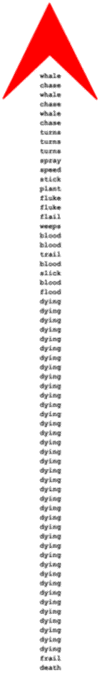
The poem is very much one for performance as well as visual display: performance which begins and continues for some time with a pounding rhythm. A drum could be used in performance or failing that hammered bass notes of a piano. The driving rhythm doesn't continue throughout. There's a natural pause at the end of the line 'flail' (line 16) and another pause at the end of the line 'flood' (line 24).
The dynamics should be very loud to begin with but gradually softer with repetition of the word 'dying,' until the word has something of the effect of the 'dying, dying' in Benjamin Britten's 'Serenade for tenor, horn and strings, Op. 31 - it would be impossible to approach its wonderful evocation at all closely - the decrescendo continuing so that the last few lines are hushed and very quiet. In performance the poem begins very rapidly but becomes slower and slower. Alternatively, readers can act like accomplished readers of musical scores, hearing the sounds inwardly.
The units can take other forms. In this short poem, the units which are controlled are consonants and vowels. There are 4 of these units in each line, with varying numbers of punctuation marks. The units are shown here in bold print and the punctuation marks in faint print. The vowels follow the sequence a, e, i, o, u and the only consonants are an initial 'l' and final 't s,' or the same consonants with {reversal}. 'List' has multiple ambiguities - the ambiguity of noun or verb, and ambiguities of meaning. It refers to leaning on one side, the list which is an item-by-item record (only the beginning of the list, the first item being 'lost lust'), and the archaic / poetic word for 'listen:' 'listen to this ... '
Last:
'Let's ... !'
list ...
lost
lust
This section gives supplementary information about the British bombing campaign during the Second World War, as background to the first poem on this page, 'Collision.'
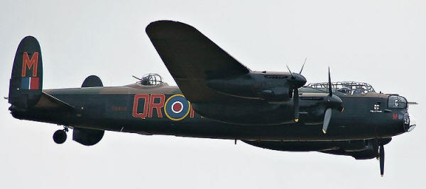
Below, the Lancaster of the Battle of Britain memorial flight at RAF Wickenby, one of only two airworthy Lancasters left (the other is in Canada.)
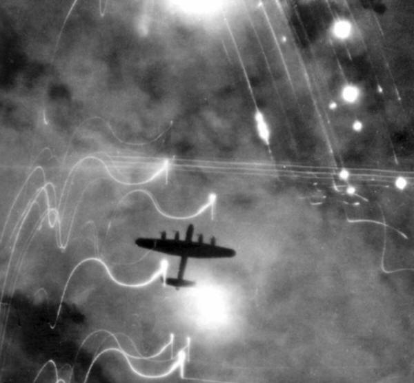
Below, Lancaster over Hamburg:
During the Second World War, 7 377 Lancasters were built. 3 249 were lost in action. 487 were destroyed or damaged while on the ground. Only 24 Lancasters completed more than 100 missions. 55 573 aircrew of bomber command were killed - not far short of half the total number.
From Max Hasting's account in 'Bomber Command' of the the first attack on Cologne, in May 1942, when for the first time more than 1 000 aircraft took part:
'At briefing, when the CO [Commanding Officer] announced that there would be more than a thousand aircraft over the target, there was a moment of awed silence. They were alarmed by the prospect of collision, but they were told that Bomber Command's operational research scientists had computed that statistically there should be no more than two aircraft colliding in the target area ... Then they walked out into the dusk of a beautiful summer evening, and took off through clear skies for Cologne.
' ... on the night of 30 May, crews in the later waves crossed northern Germany ... unable to accept the reality of the vast red glow in the sky ahead of them. Some crews thought that a great forest or heath must have caught fire, others that the Germans had created an enormous dummy fire to draw the bombers. Only as they drew near did they perceive the incredible truth, that this was the city of Cologne, ablaze from end to end.
'Micky Martin was due over target forty-five minutes after H-Hour. From miles away, he could see the huge fires lighting the sky ahead, dwarfing the pathetic flickers of flak and searchlights. Martin came in low at 4,000 feet, his crew gazing on the glowing red core of the city, broken by the silver thread of the Rhine, the shimmering white spangles of blazing incendiaries, the great silhouette of the cathedral, its twin towers still lingering amidst the miles of rubble around the Rhine bridge ... Three times Martin swung over Cologne awed, like so many airmen than night, by the devastation below.'
W. G. Sebald gives the information that 'at the end of the war ... there were 31.1 cubic metres of rubble for everyone in Cologne.' (' ... and 42.8 cubic metres for every inhabitant of Dresden ...')
My poem 'The Bombing of Dresden' is very different from 'Collision' and not a concrete poem. I give it here because I think it conveys the lurid, apocalyptic scenes in Dresden and because I attempt to convey the moral complexities - which, emphatically, don't in the least prove that the British were 'no better' than the Nazis, or that the bomber crews were war criminals. Dresden, for all the beauty and splendour of many of its buildings, was Nazi Dresden in the years before the war and in the war years. There's no moral equivalence between the actions of the Nazis and the actions taken to defeat the Nazis. The circumstances of those who flew in the bombers and those who would call them 'war criminals' are vastly different. The flight crews given their pre-flight briefing on operations against Dresden knew that they might well not return, as so many others had failed to return from operations, they were in no position to decide the strategic, tactical - and ethical - issues. Their critics enjoy advantages they never had. Nobody who reads their accounts could fairly condemn them.
My poem 'The Bombing of Dresden' is a non-concrete poem. At this stage in the war, there was a Master Bomber who flew over the area and dropped target indicators, intended to make the bombing more accurate. The master bomber is piloting a Mosquito aircraft. The 'slim sticks' are incendiary bombs. A well-known image shows a statue on the town hall above the devastated city. I refer to this statue in the closing lines.
The Bombing of Dresden
A black presence flitting above darkened eaves -
the Master Bomber's Mosquito swooping on the Sportsplatz,
near which the Polish slave labourer was hanged.
Those who watched now wait.
Waiting now are refugees, the innocent and the depraved,
those who know, do not want to know and do not know,
Jew-baiters, Jew-haters, denouncers,
informers, children,
accomplices in mass murder, children.
The calm red glow of marker flares. A call.
The opening of bomb doors, a steady drone, the first screams.
Bodies blasted like quarry stone,
windows gouged out, everywhere roofs collapsing,
everywhere worlds collapsing, the crushing of hope.
The slopping of waste in cellars,
the fall of sinister slim sticks.
Fires licking eagerly, coupling, becoming one.
Tongues of fire, rivulets of fire, rivers of fire
bursting their banks and flooding the town.
The first thousand now dead,
and the second and the third and the fourth,
and perhaps the fortieth
deep in fumes or fire,
bodies sucked into incandescence by an unnatural wind,
like minds sucked into the void of the Reich.
And watching over all
the sparks of life and the crooked
timber's glow,
from a
great height,
a statue of stone.
Frederick Taylor writes in his book 'Dresden:'
'It became fashionable among writers in the postwar period to dismiss city bombing, not only as immoral but also as essentially useless. There seems, however, little doubt that the strategic bombing campaign played a major role in the defeat of Germany (if not perhaps the 'knockout' one that Sir Arthur Harris and his supporters dreamed of), and growing evidence that it may even have proved decisive. Early postwar surveys made the mistake of confining cost-benefit analysis to a kind of simple accounting of notionally lost German production.
...
'More recent studies, especially those of Professor Richard Overy, have taken a broader view and also incuded the massive financial and material costs involved for the Reich in creating a complex and sophisticated aircraft tracking and air defense system, in rebuilding and relocating industrial and military installations, and in feeding, housing and caring for victims of the escalating Allied bombing. This not only took weapons and equipment from the frontline land troops, but also vastly reduced the number of offensive aircraft available on all fronts, especially in Russia.'
John Nichol and Tony Rennell, in the book recommended below:
'Dresden may not have had the obvious heavy, smokestack industries of the Ruhr but it did house the sort of precision engineering demanded by new weapons technology. The city's own description of itself proclaimed what was beneath the surface. Its yearbook for 1942 boasted: 'Anyone ho knows Dresden only as a cultural city, with its immortal architectural monuments and unique landscape, would be very surprised to be made aware the extensive and versatile industrial activity that make Dresden one of the foremost industrial locations of the Reich.' The city had 127 factories which purported to be turning out consumer goods and luxury items but which had secretly switched to war work. Zeiss, the biggest manufacturer, had long ceased making cameras for tourists in favour of bomb-aiming apparatus and time-fuses. A onetime manufacturer of typewriters and sewing machines was turning out armaments. Dresden china figures - for which the city was famous - were actually manufactured at Meissen, twelve miles down the River Elbe, and the workshops there had also been switched to war work and were turning out communications equipment for the army. A company which had once made waffle and marzipan machines was producing torpedo parts for the navy. Even an arts and crafts workshop was producing wooden tail assemblies for V-1 flying bombs. Machine guns, searchlights, aircraft parts, field telephones, two-way radios were just a few of the other war goods being made there.
' ... The German High Command had designated it as a military strongpoint, part of the defensive line along the River Elbe at which the Soviet advance could be held. The order from Berlin was that it was to be defended at all costs. So 'peaceful' Dresden was in reality a war factory and a fortress, and these factors alone made it a legitimate target for the bombers. But it was also a vital link in the German rail network, and it is this that probably sealed its fate. It was a cross-roads for north-south and east-west traffic.'
The aircrew about to face injury and death in the wreckage of their aircraft had in general no comprehensive knowledge of the issues. The briefing concentrated on issues such as these. Politicians and strategists had wider objectives, such as dehousing German civilians and the pursuit of area bombing. Ending the nightmare, bringing the war to an end as quickly as possible was the aim and any means which seemed likely to achieve it was acceptable to them. The aircrew were not war criminals and the politicians and strategies were not war criminals either.
There are many internet videos on the Lancaster and the bombing campaign against Germany.
http://www.youtube.com/watch?v=o2SWXg9e_0s shows colour film of the Lancaster in flight, but not in operations.
The Allied bombing campaign during The Second World War has a vast literature. These are some books which I'd strongly recommend, although I think that W. G. Sebald's 'On the Natural History of Destruction,' though a very rewarding book, doesn't quite measure up to its reputation.
'Bomber Command.' Max Hastings. An extract from the closing page of the text:
'The Federal Statistical Office in Wiesbaden computed after the war that 593, 000 German civilians died and 3.37 million dwellings were destroyed, including 600, 000 in Berlin alone, from 1939 to 1945.
...
'Surviving aircrew often feel deeply betrayed by criticism of the strategic air offensive. It is disgraceful that they were never awarded a Campaign Medal after surviving the extraordinary battle that they fought for so long against such odds, and in which so many of them died.'
'Tail-end Charlies: The Last Battles of the Bomber War 1944- 45.' John Nichol and Tony Rennell.
'Dresden: Tuesday 13 February 1945.' Frederick Taylor.
'Bomber County: The Lost Airmen of World War Two.' Daniel Swift.
The four volume 'The Strategic Air Offensive against Germany, 1935 - 1945,' by Sir Charles Webster and Noble Frankland gives, of course, a detailed account.
'On the Natural History of Destruction.'
W. G. Sebald.
'Lancaster Target.' Jack Currie.
'Lancaster.' M. Garbett and B. Goulding.
"Avro Lancaster: 1941 onwards (all marks), Owners' Workshop Manual' is published by Haynes' Manuals, better known for their guides to servicing and repair of cars. It doesn't give detailed information about the servicing and repair of a Lancaster bomber, but it does give a wealth of background information about the aircraft.
This is my poem 'Sailing from Belfast' in 'matrix form,' based on personal experience of crossing the Irish Sea at the time when terrorist action in Northern Ireland was at its height.
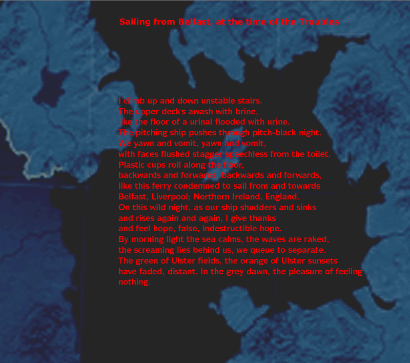
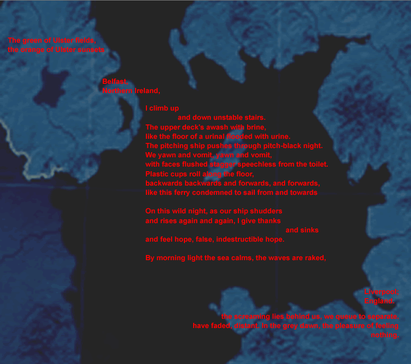
and in fragmented form, the fragments attached to the picture space, which has three regions, the Irish Sea, Ulster and Liverpool.
An animation shows the process of fragmentation and the process of reading the fragmented poem.
Almost all poetry so far has been in what I refer to as matrix form - the usual way in which a poem is printed, as a continuous block of lines. Lines or parts of lines can be freed from their position in the matrix - this is fragmentation of the matrix - and arranged in picture space.
Concrete poetry and text-design should be natural, instinctive forms rather than the result of intense theorizing. Intense theorizing can come later, if need be. A writer with visual interests looks at, let's say, a mountain and a village in the valley beneath the mountain and has something to say about the mountain and the village. What could be more natural than to place the words not in the usual setting of the poem, what I call the 'matrix,' in continuous lines, but where they belong in the picture space - the words about the mountain near the mountain and the words about the village near the village, lower down? This is 'attachment,' attaching words to where they belong in the picture space.
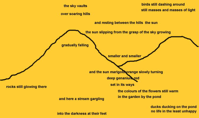
Another example of fragmentation and attachment:
The sky vaults
over soaring hills
gradually falling
into the darkness at their feet,
and resting between the hills, the sun.
The sun slipping from the grasp of the sky, growing
smaller and smaller.
Rocks still glowing there,
and here a stream gargling.
Birds still dashing around,
still masses and masses of light,
ducks ducking on the pond,
no life in the least unhappy.
The air still warm,
the colours of the flowers still warm,
in the garden by the pond,
and the sun, marigold orange, slowly turning
deep geranium red,
set in its ways.
Words can be attached too to parts of a non-representational composition. Here, there's more freedom of action in placing the words in the picture space. The designer may take account of considerations which are familiar to artists, such as balance, proportion, deliberate use of imbalance and disproportion, arrangement of masses along horizontals, verticals and diagonals. This is the practice of text design, which offers exhilarating opportunities.
All this has important implications for the {direction} of a poem and the reading of a poem. The reading of a traditional poem in matrix form is obviously simple: from the left hand side of the first line to the right hand side of the last line. When a picture poem or picture text is read, {direction} is more complex, as shown by the eye movements of the reader when looking at the picture space. In the animation, the complex eye motions are shown by the movement of the red rectangle. For example, the first lines of the poem may be placed in the lower right hand corner of the picture space. The next lines may direct the viewer to the lower left hand side, to be followed by a shift to top right. There may be frequent pauses, allowing time for concentrated attention on a single part of the picture space and the words in that part of the picture space. Poetry and other texts become less subject to time. (The non-temporal aspects of poetry and other texts and the temporal aspects of visual art interest me very much.)
Mines is another attachment poem, the lines being attached to an image of the mine workings. Whale isn't an attachment poem. The words form the shaft of the harpoon rather than being attached to an image of it.
An example of strata poetry. My poem 'Mines:'
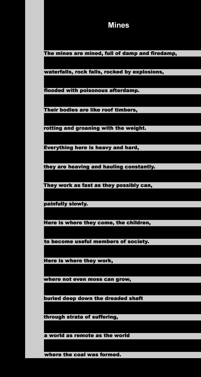
The word 'mined' is a play on words and a reference to explosive mines used in warfare - land mines, aerial mines and sea mines. The gas firedamp in mines, mainly methane, is explosive when mixed with air. After firedamp has exploded in mines, the poisonous gas afterdamp, made up mainly of carbon monoxide, is formed. Children worked in mines in this country until the passing of the Mines Act of 1942, which prohibited the employment of girls, women and boys under 10 years old.
The architect Frank Lloyd Wright had 'an obsession with strata of rock as an inspiration for horizontal stratification in buildings' and a consuming interest in 'the larger theme of "Nature" as a model for architecture.' (From the fine review by William J. R. Curtis of 'The essential Frank Lloyd Wright: critical writings on architecture' in the Times Literary Supplement.)
Poetry has very often taken the larger theme of "Nature" as a model, but I make use here of the linkage between strata and lines of poetry. In the representational poem above, the strata are the seams of coal, the lines of the poem are the low tunnels dug into the seams. The strata are also layers of suffering, penetrating deeper and deeper into a world of almost unimaginable harshness. Concrete poems are often playful, sometimes no more than technical exercises, sometimes as trivial as doodles, but I see every reason to use concrete form for the most serious ends.
It shouldn't be thought that I oppose industrialism or think that the industrial revolution was a false turning in human history. Quite the opposite. The industrial revolution inflicted a vast amount of avoidable suffering, unavoidable suffering, and has spared vast numbers of people in later ages the suffering which is inevitable when nature is insufficiently controlled. Our age, which is very much aware that nature can also be controlled far too much, would not benefit overall if this progress were reversed and we had to live in a state of nature, life, in the words of Hobbes, 'nasty, brutish and short.'
Faulting in poetry is a technique which can be applied to the line-strata. Poem-faulting has a linkage with geological faulting: layers of rock are fractured and a block may move vertically downwards. In the same way, in faulted poetry some or all of the lines are fractured and a block moves downwards, so opening up the interior of the poem, with significant effects upon poetic texture.
In a poem with an appreciable number of lines and with lines of appreciable length, there's zoning, the contrast between the border region and the interior. Words deep in the interior of a poem may be denied their full force. Faulting opens up the texture of the poem. The challenge is to ensure that the faulting of the lines is the result of emotional, poetic force.
Punctuation and festive lights
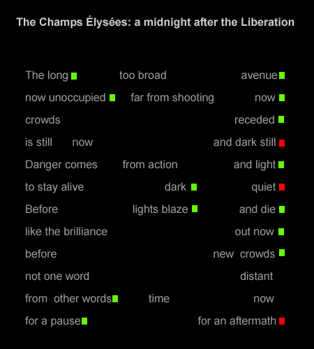
The patterning which is characteristic of concrete poetry is achieved by the arrangement in space of words and lines.This is probably a unique example of further patterning by punctuation. Full-stops ('periods' in American English) are shown as small red blocks and commas are shown as small green blocks, to give the effect of festive lights which are in tension with the sombre grey text and black background and the sombre diction. In this period immediately after the liberation of France from Nazi rule there's austerity but also very much to celebrate.
The poem is an example of pulse poetry as well as concrete poetry.
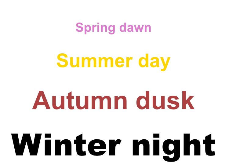
The lines of this poem of mine show linkage by meaning. There's progression in the poem which is dual: the seasons on the left, times of day on the right. The poem is obviously very simple, or deceptively simple. It offers the reader the literary equivalent of psychoanalytic 'free association,' 'a method of exploring a person's unconscious by eliciting...thoughts that are associated with key words provided by a psychoanalyst.' (Collins English Dictionary.) The poem obviously should not be read quickly. There has to be time to summon up images, memories. The poem is pictorial in its use of colour. The black of the last line, in the font Arial Black, represents, of course, the winter night. Other appropriate colours are chosen for the other lines.
The example here is blurred deliberately, although some of the content can
be read. The content - which would require disproportionate space to explain
- is less important than the shape.
It has the same shape as a cruciform poem such as the one by Roland Sabati but that's the only linkage. For a reproduction of Roland Sabati's poem click here.
It's a fine design but it surely isn't a poem. None of the 'concrete poems' on the page - some of them, again, very fine designs - are poems. Blake's illuminated poem is a poem but not a concrete poem. I discuss differences between poetry and non-poetry later.
Transept poetry has a linkage is with the transepts of a church ('the wings of a cruciform church at right angles to the nave.') Suppose you are in a church with a very long, narrow nave. Walking along the nave gives a feeling of spatial constriction but, when the transepts are reached, the feeling of spatial opening. The feeling is well expressed by Nikolaus Pevsner, who describes the interior of Ely Cathedral, including its unique feature, the Octagon, in 'The Buildings of England: Cambridgeshire.' The Octagon is 'a delight from beginning to end for anyone who feels for space as strongly as for construction. For the basic emotion created by the Octagon as one approaches it along the nave is one of spaciousness, a relief, a deep breath after the oppressive narrowness of the Norman work.'
In the reading of a transept poem there are similar contrasts in passing from the narrow lines to the wide lines, and, also, in passing from the wide lines to the narrow lines. The wide lines, the 'poem-transepts,' can be placed at any point in the poem, at the top or bottom of the poem as well as in the middle. The poem need not be cruciform in shape, although the example above is cruciform.
Transept poetry is an instance of poetry in which line length is important. On the linked page where I discuss this, I write:
'Proportion and disproportion are important considerations in the discussion of variable line poetry, as they are in the discussion of architecture. The architectural critic Alec Clifton-Taylor makes the point (in 'The Cathedrals of England') that 'York nave is yet another English Gothic building which is too broad for its height.' A literary critic may make the point that the short lines in a poem of lines of variable length are too short in proportion to the long lines, or that there is a disproportion in the number of shorter lines compared to the number of longer lines. If, for example, the number of shorter lines is insignificant, the contrast may be muted and ineffective. Proportion is important in poetry as in architecture but this is not to say that poems should always be well-proportioned. The deliberate use of disproportion is a valuable technique. It can produce extreme, very modern effects.'
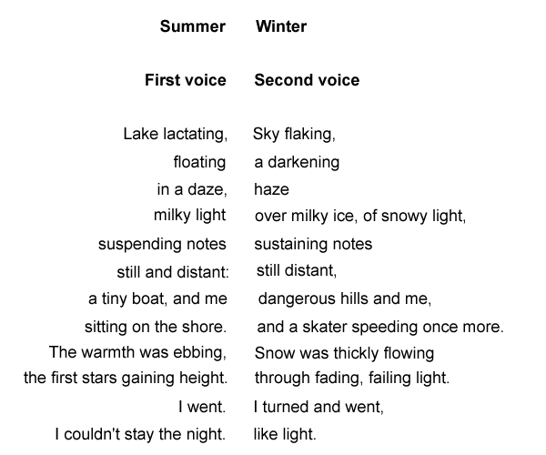
This is the poem Derwentwater. There's a vertical axis which divides the poem into two halves. A dictionary definition of axis (Collins English Dictionary): 'a real or imaginary line ... about which an object, form, composition, or geometrical construction is symmetrical.' Since axis poetry gives shape to the poem on the page, it can be considered a form of concrete poetry.
The poem is read 'along' the line, preferably by two readers. The rhymes of the two halves are 'along,' horizontal, but the grammatical sense is vertical, 'down' each of the two columns. Although the diction is plain and simple - 'milky' applied to light and to ice, for example - it's transformed by putting the words and phrases in the two halves of the poem in close proximity. The two halves obviously show strong contrasts of theme - summer and winter - but there are also subtle contrasts of syntax and punctuation, for example, 'still' in the half-line of the first voice, 'still and distant' is different, grammatically, from the 'still' in the half-line of the second voice next to it, 'still distant.'
The layout of things far removed from poetry underlies the axis form. Consider a simple set of mathematical equations and the way in which the equations are laid out on the page, or a set of linkage statements in the notation I've devised and the way in which these linkage statements may be laid out on the page, the linkage brackets < > in a vertical line. The contents and linkage brackets are left blank in this illustrative example.
a = c
- b
b = 2
c = 4
a = - 2
[ ] < > [ ]
[ ] < > [ ]
[ ] < > [ ]
Lines of poetry can be laid out on the page in a similar way. The poem is divided into approximately two halves, left and right. There are linkages between the lines on the two sides. Centred rhyme can also be considered as a form of axis poetry. In this case the axis is horizontal and the two halves of the poem are upper and lower.)
What linkages may there be along a vertical axis? There are various possibilities. These are only a few:
A space generally shows the position of the vertical axis. The organizing principle which links the left side of the line and the right side of the line and which is, as it were, placed in the space, may be no more than a pause, the space being the visual counterpart of the pause. The pause is a development of the caesura. The caesura is generally applied in an informal way, the space-pause in axis poetry is applied in a systematic way, and is presented in a systematic way on the page. The result is a series of split lines. James Dickey employed split lines in his poetry, sometimes with one space in the line, sometimes with more than one, presenting the spaces unsystematically, without a vertical axis. An excerpt from James Dickey's 'The Firebombing:'
Slants is woven with wire thread
Levels out holds together like a quilt
Off the starboard wing cloud flickers
Another possible organizing principle is equality, the linkage being with the equals sign in equations like the ones above. There can't, of course, be strict equality. Mathematically, equality may indicate that the expressions on either side of the sign have the same reference. This can be implemented in lines of poetry, the left side of the line having the same reference as the right side of the line.
Other organizing principles are conjunction and disjunction. Disjunction - disconnection or separation - is suited to many different contents: opposing views, sharply contrasted views, but also a dialogue between different minds, of the kind found in Yeats' 'A Dialogue of Self and Soul,' or in his 'Ego Dominus Tuus,' although the form generally demands more succinct statements than in either of these. Like the other organizing principles, disjunction can lead to poetry which transcends the organizing principle, to a poetry which is not at all abstract. Consider this very clear and, in fact, systematic example of disjunction, even if the disjunction isn't shown along a vertical axis, from Shakespeare:
CRABBED
Age and Youth
Cannot live together:
Youth is full of pleasance,
Age is full of care;
Youth like summer morn,
Age like winter weather,
Youth like summer brave,
Age like winter bare;
Youth is full of sport,
Age's breath is short,
Youth is nimble, Age is lame;
Youth is hot and bold,
Age is weak and cold,
Youth is wild, and Age is tame:—
Age, I do abhor thee;
Youth, I do adore thee:
O! my Love, my Love is young!
Age, I do defy thee—
O sweet shepherd, hie thee,
For methinks thou stay'st too long.
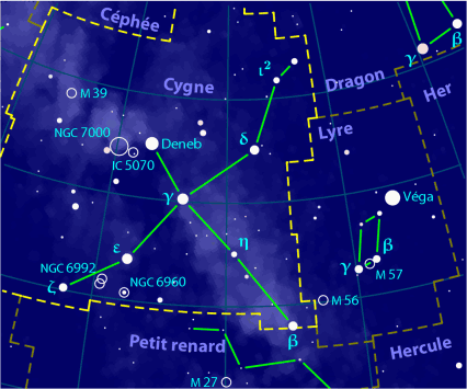
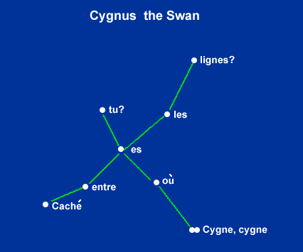
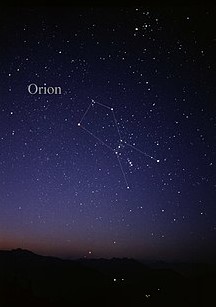
Constellation poetry uses images of star constellations as an organizing principle.
Each word (or syllable) is attached to a star. One of the concrete poems I've
written in this form is in French, 'Cygne,' Cygnus The Swan. The word 'Cygne'
is repeated. The star to which the repeated word is attached is a double star,
a primary and a companion star. (Patrick Moore: 'probably the most beautiful
object of its kind in the whole sky.)
Cygne,
cygne
où es tu?
Caché entre les lignes?
A literal translation, which doesn't preserve the sound linkage between 'cygne' and 'lignes,'
Cygnus,
cygnus
where are you?
Hidden between the lines?
There's an obvious allusion, in French, to the English 'reading between the lines.'
In rhyming 'cygne' with 'lignes' here, I break the 'rule' in French verse which forbids the rhyming of a plural with a singular, unless the singular ends in 's.' Roy Lewis has a good section on this rule and others in his 'On Reading French Verse: a study of poetic form.'
Licence given to me to make use of the first image of Cygnus in this section requires me to insert this notice:
Copyright (c) 2010 Paul Hurt
Permission is granted to copy, distribute and/or modify this document under
the terms of the GNU Free Documentation License, Version 1.3 or any later
version published by the Free Software Foundation; with no Invariant Sections,
no Front-Cover Texts, and no Back-Cover Texts. A copy of the license is included
in the section entitled
"GNU
Free Documentation License".
The Latin phrases have been quoted and used often in publications in English. Each word has a close linkage of sound and meaning with a word in English:
Mysterium
- mystery
Tremendum - tremendous
Oratio - oration, speech
Obliqua - oblique, indirect
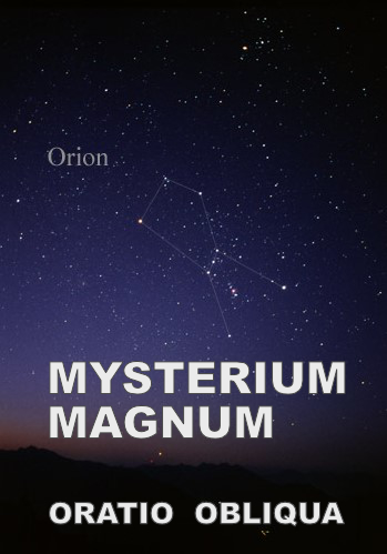
I use
the three stars in the centre of the Constellation which have much smaller
magnitudes than the other stars as a punctuation mark ... Without showing
line endings:
ORION
MYSTERIUM TREMENDUM . . . ORATIO OBLIQUA
The title is part of the concrete poem: there's a sound linkage between 'Orion' and 'Oratio.'
Rudolf Otto discussed numinous experience in his influential book 'Das Heilige,' translated as 'The Idea of the Holy.' He wrote that 'Mysterium tremendum,' the 'Tremendous Mystery,' is an aspect of the numinous, which can have a linkage with belief in God, gods, the holy and the transcendent. Many non-believers have found the idea of the numinous important and have given it a non-religious interpretation - as I do myself.
The English composer and poet Ivor Gurney wrote from the trenches that he 'illicitly walked under the stars, watching Orion and hearing his huge sustained chord ... through the night.' (Quoted in Geoffrey Hill, 'Collected Critical Writings.')
'Oratio obliqua' is 'indirect speech,' as in 'they said that the starry night was numinous' rather than the direct speech of 'the starry night is numinous.' The starry night has numinous power, but for me an oblique, indirect power, which deepens its mystery.
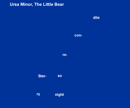
Starry
night
so recondite.
Here, the syllables are short and show the position of the stars rather than being attached. The syllables given particular emphasis (shown in bold print immediately above) have the sound linkage of rhyme. These syllables show the positions of the stars which have the greatest magnitude in the constellation of Ursa Minor, alpha and beta - alpha is Polaris, the Pole Star.
The starry night is described as 'recondite' as 'requiring special knowledge to be understood' (Collins English Dictionary), or at least in one important aspect of understanding, the special knowledge of astronomy.
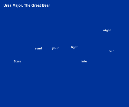
Stars,
send your light
into our night.
As the
word are short, I use them to indicate the positions of the stars.
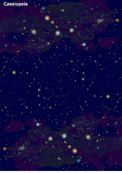
Cassiopeia is the W-shaped constellation, here presented below its inverted form, the letters 'MW' standing for
Milky
Way
The Milky Way flows through Cassiopeia. I use the image to illustrate 'Innumerable, tiny stars as beautiful as large stars.'
This image is an instance of Text Design rather than Concrete Poetry.

Concrete poetry shouldn't be a poetry of simpletons, for simpletons. A concrete poem of any value should have far more sutlety and depth than an emoticon, such as a smiling face or a sad face. Why do I claim that this is a poem, and not just a poem but a far from simple poem? The title is relevant: 'Anti-emoticons,' not 'Emoticons.' If the reader/viewer knows that what seem to be emoticons are opposed in the poem, then this is at least a start in the layering which makes for complexity. Admittedly, further background information is needed to take the layering, the building of complexity, further. This is one of those poems which require notes for its full appreciation. This is the necessary background (from my page The culture industry.)
'BBC1 News has been using graphic design in more and more obtrusive, more and more ludicrous ways, in accordance with its guiding policy of progressive (or regressive) infantilization. How much longer before news of a better than expected inflation rate or a success in English football is accompanied by the display of a happy, smiling emoticon and news of a natural disaster or news from a war zone is accompanied by the showing of a sad emoticon?
'The team of 'graphic designers' at the BBC already has a repertoire of emoticons, primitive products of advanced computer technology which spell out, in the most hackneyed way, what viewers are expected to feel. BBC1 News, as well as showing the desperate and grotesque state of the world shows too the desperate and grotesque state of some sections of the media, such as the BBC itself.
'Bad news from a bank, bad news from the City of London - this calls for dark and gloomy storm clouds above some typical high-rise financial buildings.
'To show that someone is very newsworthy but under pressure, that the news about the person is very important, the film of the person walking is slowed down, so that the person doesn't just walk but walks with very, very significant steps.'
The poem can be written in straightforward text form, and this is obviously it:
BBC
BBC
Some of the poems on this page are extended but this is obviously not one of them. The text is ultra-minimalistic. It's a rhyming poem. The lines are linked by sound and the sound is very similar in the two lines, but not, despite appearances, identical. The principal difference is that the letter 'C' in the second line will receive markedly more emphasis.
Poetry is a monophonic medium, like works for solo voice or solo instruments which aren't able to play chords, or which can produce chords, but not in the movement or movements concerned, for example many movements of the Bach Suites for unaccompanied cello and the Partitas and Sonatas for unaccompanied violin. Most music is made up of more than one line, and the various lines can be used polyphonically or with the emphasis on harmony, for example a melody with supporting harmonies given to other voices or instruments. This is a very great advantage in music. Poetry's {restriction} to monophony is potentially a very great disadvantage. The disadvantage is overcome by such devices as ambiguity, which in effect gives two or even more lines - lines of meaning, that is - and the resonance of poetic language, which gives 'poetic harmony' ('poetic harmony' understood not in a hackneyed, sentimental way.)
Concrete poetry opens up remarkable new possibilities - poetic complexity given by the interaction of word and image. If the words, whether part of a line of poetry or not, are regarded as having a linkage with a musical melody, the images can be regarded as having a linkage with an accompaniment. Or the two elements can be regarded as having a linkage with polyphony. In essence, they contribute to layering of the poem, which gives opportunities for satisfying complexity.
Rotation of a letter in space opens up new opportunities in concrete poetry. In 'Anti-emoticons,' the 'C' is rotated counter-clockwise through 90° to give the smiling mouth in the upper image. This is rotated through 180° to give the sad mouth. Emoticons are used to express, without any subtlety, emotions such as approval and disapproval. The faces are used in this standard way here. In the upper image, approval of the BBC, in the lower image, disapproval. Obviously, anyone hoping to write concrete poetry or to appreciate it should have an intense interest in the spatial dimension as well as the verbal dimension. Simple rotations in space can be interesting, even exhilarating,
In the section Letters: the wrong shape? I discuss some difficulties in using letters for design. A suitable choice of font can sometimes eliminate these difficulties. The font 'Corbel' is used for the letter 'C' in these images and gives a mouth of suitable shape. Most other fonts would be unsuitable, for example, Times Roman. Arial Black is used for the letter 'B.'
The section of the page The Culture Industry explains that the BBC has been making increasing use of emoticons - not simple smiling or sad faces, but images which are just as crude, and that I regard the trend with disapproval. So I regard this as a tensile poem, with an apparent contradiction. The poem is reflexive. A device is used to condemn a device.
An important question to be asked of any poem is, what kind of poem is it? A poem shouldn't be judged by irrelevant criteria. Concrete poems are of the most varied kinds, or should be. This is primarily a satirical or sarcastic poem.
John Heartfield wasn't a concrete poet but his satirical and sarcastic use of images, sometimes incorporating prose, can be strongly recommended. (He was born in Berlin and changed his name from Helmut Herzfeld during the First World War, anglicizing it in protest against German nationalism and militarism.) Dawn Ades has a good section on his work in 'Photomontage.'
One of the pieces illustrated is John Heartfield's 'Hurrah, the Butter is Finished! '

Dawn Ades writes, 'Many of Heartfield's best jokes - which in being funny lose none of their savagery - involve a literal translation of Nazi rhetoric. So, in Hurrah, the Butter is Finished! (19 December 1935), the text at the bottom gives a quotation from a speech by Goering: 'Goering (in his Hamburg speech): "Iron always makes a country strong, butter and lard only make people fat." ' So Heartield shows a family chewing obligingly on iron ...' Even the baby in its pram and the dog are eating articles made of iron.
Introductory
comments
The basics: elements and composites
Questions to ask
Success
Activism and politics
How not to theorize
Songs and opera
The prestige of poetry
Poetry and non-poetry
''Concrete music'
Beyond poetry and prose
Letters: the wrong shape?
Poems on this page
Faulty
'linguistically innovative poetry
Poems on this
page
Compartments of the mind
Faulty 'linguistically innovative poetry'
In praise of 'concrete poets'
Eugen Gomringer, Marcel Duchamp, Handel
Introductory comments
stevecadman's photostream
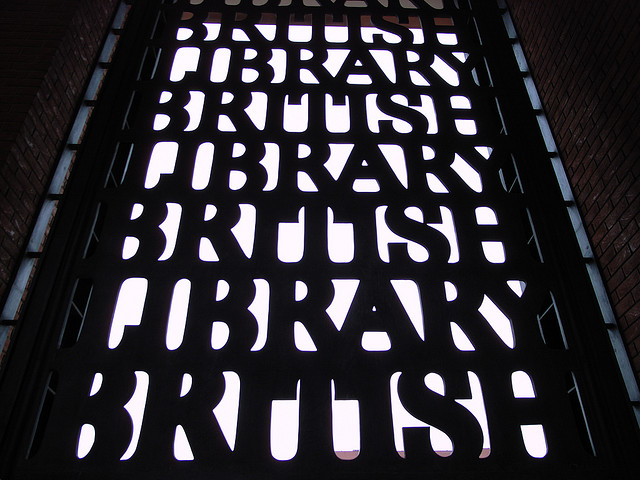
This is obviously not a poem, but a very strong and successful design, making full use of a property of the two different word-lines: they are equal in length, 'British' and 'Library' each having seven letters. I argue that concrete poems often owe their success to their design, not to any poetic content.
This is an outspoken account - in part. I argue that
'concrete poetry' is a misleading name for most of the works that claim it.
practitioners and commentators have generally forgotten to ask the basic question: is this particular concrete work any good? Instead of honest artistic evaluation, {substitution}: manifestoes and theory.
although theorizing about literature is a completely legitimate activity, a significant amount of 'literary theory' is routine verbiage and the name 'theory' is a completely misleading name for many of the works that claim it: its application to concrete poetry, as to other branches of poetry, is mindless. Even good and interesting theory can be misapplied.
in general, the claims made for the social and political effects of concrete work are delusions, although delusions which are often creditable to the practitioners or commentators holding them.
in general, this field, a fascinating and important one, is in need of basic, healthy criticism. Concrete poetry is neglected by most writers and readers of non-concrete poetry. It's neglected in a different sense (like a neglected garden or farm) by some of the writer/designers and commentators who work in it.
But the criticisms I make are intended to be friendly, not hostile, as the section In praise of concrete poets makes clear.
Although a great deal of what follows is established and familiar, I often provide new concepts, such as 'regions of the poem,' for poetry as highly organized form. Things which are established and familiar are far from being beyond dispute. As anyone familiar with the field will know, there are disagreements about so many of its aspects. I think that the fairly systematic approach I use, particularly in the section 'The basics: elements and composites,' may help to clarify some things. I'm far from having an aversion to theory. My approach is unlike any other because it makes use of the ideas in {theme} theory which I've evolved and which are explained in the page Introduction to {theme} theory. This is the reason why some terms, such as {separation} and {direction} above are enclosed in curly brackets, and the term {theme} itself.
All the same, everything here can be understood without any knowledge of the background in theory. I use the theory very sparingly and in a non-technical way. Despite my strong interest in theory, my starting point here is my own practice in concrete poetry. Although my approach is quite systematic, it's far from being comprehensive and detailed. I explain my own views but I give little indication of the very diverse views and activities of other practitioners. So, {restriction} is applied.
I emphasize the need to 'place' the concrete poem or 'concrete poem,' to evaluate it, but not as a whole. There's the need for {separation} of the two elements of design and language. One element may be much more successful than the other. Non-concrete poetry is 'placed,' nobody with the least interest in poetry (or informed interest in poetry) supposes that all poems are on the same level. There are better and worse poems, poems of permanent interest and very slight poems. The need for evaluation of concrete poetry is very often overlooked. The poetry or 'poetry' of concrete forms is given exemption, which is a form of {restriction}.
I discuss the problematic nature of the letters used as elements of design. Here, elements which have a primary function, conveying meaning, one they perform very successfully, are given a completely different function, as a primary contributor to a visual design. Whenever a thing with a primary function is given another function, problems may arise.
The basics: elements and composites
Concrete poetry and the kind I think is misnamed, 'concrete poetry,' are both composite forms.
In the
case of concrete poetry, the elements linked in the composite are design and
poetry:
[design] < > [poetry] to give design-poetry form
or poetry-design form (the two aren't synonymous.)
In the case of 'concrete poetry,' the elements linked are (1) design (2) words
and/or letters: words-design or letters-design form.
(Again, not synonymous.) Anticipating a conclusion, I think that the elements
aren't usually even approximately equal. The
{ordering}
is important and the element given more emphasis ({prior-ordering}) is placed
second in the convention I use. In this section I make comparisons with other
composite forms: song and opera, words-music form - this
includes poetry-music form - and with a hypothetical form
which is very instructive, 'concrete music' (not to be confused with the established
school 'musique concrète.') 'Concrete music' is music-design
form.
Questions to ask about the elements and the composite
Are the elements compatible? Is the form possible at all?
If the form is possible, is the linkage so difficult to achieve that the creation of works in the form is problematic?
Are the elements linked regarded as equally important?
Are the elements linked in practice equally important?
Are the elements in a particular composite more or less equal in their artistic success or is one element obviously much stronger artistically?
If so, does the relative artistic strength of one element, the relative feebleness of the other, significantly lessen appreciation of the composite work?
Are the criteria for appreciating an element not linked with another element in a composite suitable for appreciating an element which is part of a composite? For example, should the poetry which is part of a concrete poem be judged by the same criteria as other poetry? (If, for example, the poetry of concrete poetry is far more likely to be whimsical than a poetry of depth and profundity, how should we respond? Should whimsical poetry be regarded as an important kind of poetry or a very minor form?)
How suitable are letters and other elements of written language for use in a design? Are their shapes suitable or obtrusive and unsuitable? Are some letters much more suitable than others?
The artistic success of composite forms as of non-composite forms is surely a very important consideration. The overcoming of technical problems and ingenuity aren't enough. If someone succeeds in carving a complete poem on a very small pearl to create a kind of sculpture-poem then we can admire the achievement, but we still have to ask, is the poem any good? (The critic Martin Seymour-Smith wrote of the 'shallow ingenuity' of the British playwright Tom Stoppard.)
The provision of a manifesto and the social and political idealism of some works in concrete form - these and similar considerations aren't enough either. The page {substitution} contains a long but not complete list of factors which are often used as a substitute for evaluation. I acknowledge the importance of these secondary factors whilst insisting that they can't possibly be used as a substitute for evaluation.
Although the language element of concrete poetry hasn't been evaluated at all adequately, it has probably been evaluated to a greater extent than the design element. There are comments on the general inadequacy of the language of 'concrete poetry,' for example Roberto Simanowski's comment that 'experimental poetry - which concrete poetry is part of - has been accused of being an autistic language...' In his lecture, Concrete Poetry in Digital Media he quotes one of the 'selves' which have very different attitudes to the digital media: 'There are many spectacular effects people program in digital media. If they only would find some meaning to hook on to it! But they can't think of any because they are programmers not poets. They have an idea of how to make an action happen on the screen but no idea of what this action could mean. They flex their technical muscles ... But they have nothing significant to say.' This is a general difficulty, with a vast range of examples, not confined to the {separation} between the technical and the emotional. To give just one example, the {separation} between the skills of growing and cooking. People who have the skills to grow crops of superb quality may not have the skills to cook them in anything but an unimaginative way - or the time and energy needed to grow these crops may not leave enough time and energy to cook them well.
The 'poetry' of 'concrete poetry' isn't usually poetry at all. A more truthful description of the writing would sometimes be 'concrete jottings' or 'concrete scribblings.'
Even so, the design of concrete jottings or scribblings may well be very successful, an artistic achievement. As for myself, more often than not, I'm very impressed by the design element of 'concrete poetry.' It's rare that I find a design which I think is abysmal.
A very good case could be made for considering the design element of 'concrete poetry' as more important than the language element, for the inequality of the elements, although I think that the majority of creators (or 'practitioners') wouldn't agree. Because I place the emphasized element second, my own view is that 'concrete poetry' is generally a words-design form, not a design-words form.
Marjorie Perloff writes that 'in the 1980s and 90s, the going view, especially in Anglo-America, where concrete poetry had never really caught on, was that the 1950s experiment in material poetics was ideologically suspect - too "pretty," too empty of "meaningful content," too much like advertising copy. In the university, this estimate still prevails. To this day, one would be hard put to find an English or Comparative Literature department that offers courses in concrete poetry. Doesn't the subject belong more properly, if at all, in the art department, my colleagues ask, specifically in courses on graphic design?'
The last point is a valid one. A course on graphic design would seem the most suitable place to study most existing 'concrete poetry' but an art has a future (in most cases) as well as a past and present. A renewal of 'concrete poetry' could give us an art very different from graphic design.
The other points are largely invalid. 'Ideologically suspect' is a very careless phrase - according to which particular ideology or ideologies? Very important works of art have been 'ideologically suspect.' "Too pretty" is limiting. Attractiveness and even beauty could have been considered at the same time. The criticism that 'concrete poetry' is too empty of "meaningful content" is wide of the mark. The content of the language element is reduced but usually meaningful. The criticism could be equally well directed at non-concrete works which abandon meaning to some extent or to a large extent. Some of these are artistic failures, some are not.
In the last section I mentioned the 'social and political idealism of some works in concrete form' and claimed that idealism shouldn't be confused with artistic success. In her intelligent and interesting and perhaps indispensable book (the fact that it's difficult to obtain doesn't have any bearing on its indispensability) 'Concrete poetry - a world view,' Mary Ellen Solt writes of the Brazilian Decio Pignatori that he 'makes an anti-advertisement from an American advertising slogan, condemning both the culture that makes and exports coca-cola and the culture that drinks it ... By simply exchanging the position of the vowels in "coca" the poet gets "caco" ("shard"). With this most economical method he is able to bring into the poem a most provocative question: What will the archaeologist of the future be able to say about our civilization if the shards we leave are fragments of coca cola bottles The final, damning word of the poem "cloaca" ("filthy place,""cesspool") also takes its letters from "coca cola."
This is potentially commentary and analysis as a substitute for evaluation. As a matter of fact, I'm very sympathetic to this criticism of the Coca Cola Corporation. I've written about it myself, on a page which is concerned with schools.
Activism is something which concerns me a very great deal. I've written about it in various pages on this site, amongst them the pages on bullfighting, the death penalty and animal welfare. Constructive opposition can be achieved by thought as well as action, as I make clear in a discussion of campaigning techniques in bullfighting. This cites the enormous impact of the penal reformer Beccaria, who had none of the attributes of the practical activist.
I don't think that typographic experiments can be similarly effective, as the scholar Johanna Drucker claims for Dadaism, 'which was concerned with opposing the established social order through subverting the dominant conventions in the rules of representation.' What's missing here is a healthy respect for reality, a healthy skepticism about the effectiveness of typography as an agent of subversion. Roberto Simanowski comments on Johanna Drucker's claims, 'In this perspective, the deconstructive play with the symbolic order of language is considered to question social patterns and to even have revolutionary potential.' In this country, a tiny Marxist splinter group used to put up posters which had the heading, 'Preparing for power.' 'Preparing for political irrelevance' and 'Preparing for political extinction' would have been a realistic statement for this particular group. A claim for the revolutionary potential of 'the deconstructive play with the symbolic order of language' is no more realistic. Just as unrealistic is the claim, made by Derrida, that 'South African apartheid, which some dull analysts had blamed on a tenacious and fearful white minority, was actually brought about by phonetic writing.' (Felicia Marronez, commenting on 'Postmodern Pooh' by Frederick Crews, a book about the intellectual mediocrity of so much postmodern thought. Sandy Starr comments that the book is intended to satirise '...the kind of critical writing that academics and students generally come up with today - evasive, incomprehensible, and making enormous, unjustified claims for the power of texts and language.')
In his
comment, Roberto Simanowski is simply stating and interpreting the views of
Johanna Drucker. In general, he states difficulties fairly and openly, as
in this comment: 'Experimental poetry - which concrete poetry is part of -
has been accused of being an autistic language and therefore of being incapable
of having an impact on the reader's consciousness. Thus, concrete poetry seems
to be useless in terms of political interventions.' A vast range of linkages
is revealed if this last phrase, 'useless in terms of political interventions'
is given restatement in terms of
{modification}.
If P is 'political interventions,' ~ ![]()
![]() P
P
In a later section, I quote from the page design principles. One thing may have more than one function, but it may be that it's far better at performing one function than others. In the case of poetry and writing-design, there's not just one obvious function but a range of functions. Even so, I think that poetry and writing-design may be quite poor, or not the best choice, for some functions which are often allocated to them. Poetry can be used for social and political protest but it's usually not the best or only way of making social and political protest. It may be difficult to combine protest with other 'functions' of poetry, such as expression of complex emotion.
My concrete poem Whale is intended to be a protest. I very much believe in protecting these magnificent mammals: 'Save the whales!' Even so, the opening lines, 'whale/chase/whale/chase/whale/chase' with their pounding rhythms convey, I hope, the visceral excitement of pursuing the whales, even as I condemn the act. Compare the lines I quote above:
Be
happy, be contented, be unsatisfied, be many.
Feel the ecstasy of the hunter,
the terror of the hunted,
the anger of the one who acts to stop the killing -
but of course, so rarely can.
Later, I'm sure that the poem makes amends by conveying the poignant death of the whale, the bringing of the magnificent animal to 'frail/death.' Non-activist poetry, poetry which mentions but makes no criticism of the chasing and death of an animal, can be justified because it performs so well its primary function, conveying such emotions as rapturous excitement, as with the remarkable passage in Wordsworth's 'The Prelude,' beginning at line 425 (1805 edition) and which includes the lines:
...woodland
pleasures, the resounding horn,
The pack loud bellowing, and the hunted hare.
So through the darkness and the cold we flew,
Writers in concrete forms, like typographers, who oppose an abuse shouldn't suppose that poetry or typography is automatically the best way of opposing it. Conflicting claims and paradox are surely essential to contemporary literature. It shouldn't be supposed that 'activism through literature' will be at all straightforward.
The claim of Johanna Drucker in the previous section illustrates, I think, a faulty relationship between theory and the concrete - by which I mean not the concrete poem but the world of events, facts, reality. (I certainly have the philosophical sophistication to be aware of the challenges to such views of reality, to common-sense views of the world, from, to give just one example, Berkeley.) These claims belong to what I call the word-sphere.
Of course, the word-sphere is the natural home of imaginative writers. This isn't a pejorative use of the term. 'Word-sphere' in the pejorative sense refers to evasion, to faulty {substitution}. The word-sphere is often used to evade reality. Reality is very often difficult, intractable, sometimes defeating any attempt at {modification}. It's far easier to arrange words so that words become a substitute for action, so that words deflect attention from the lack of action. This is the world of ringing declarations and facile claims. It offers a more congenial home than reality. The word-sphere is the natural home for ideologists even when action in the world isn't an issue, avoiding the need to come to terms with uncomfortable facts.
What Daphne Patai and Will H. Corral, the editors of 'Theory's Empire,' have to say about theory is very well expressed: 'these theories aren't really theory but approaches...Terms such as "approaches" or "perspectives" don't suggest the scope, explanatory power, or level of generalization one expects from a theory. Most theory anthologies and guides to the practical application of Theory, do not address the incoherence of their use of the operative term.'
Theories of concrete poetry, all literary theory, should have a linkage with scientific theories (but not by being 'scientistic:' there are vast differences between the world of the natural sciences and the world of literature.) In science, theory plays a completely healthy, indispensable part. Theory has a very close linkage with concrete observations and experimental results. Science has no use for theory as free-floating, in a sphere of its own, autonomous, unrelated to the reality of observation and experiment. 'Uncomfortable facts' in science are regarded as very important and are not evaded. At the same time, successful scientific theory, such as the kinetic theory which explains the concrete event of steam lifting the lid of a kettle, is very abstract.
If my discussion here of these very extensive issues seems so brief as to be inadequate, I'd reply that the rest of this site offers examples of argument to do with the linkages between theory and non-theoretical reality.
Concrete poets and 'concrete poets' should be encouraged by the fact that there are many musical masterpieces which have as an element in the composite language vastly inferior to the music in quality, language which is sometimes banal or ridiculous. It's doubtful if many of them will be encouraged.
Concrete
poetry/'poetry' is generally concise and not dramatic. Its conciseness is
part of the reason it can't be fully dramatic, in the sense of theatrical
drama or operatic drama. Aristotle was right, I think, to demand of dramatic
works what he called ![]() 'megethos,' 'substantial size.' Perhaps concrete poets/'poets' will create
massive, dramatic works in the future, but it's very unlikely. Opera has some relevance to concrete
forms, but as an extended, dramatic form not nearly as much as song. There
are song cycles but songs are generally concise.
'megethos,' 'substantial size.' Perhaps concrete poets/'poets' will create
massive, dramatic works in the future, but it's very unlikely. Opera has some relevance to concrete
forms, but as an extended, dramatic form not nearly as much as song. There
are song cycles but songs are generally concise.
Every great or good opera has, I think, a libretto much less great or good. The librettos of Mozart's librettists, Lorenzo da Ponte and Emanuel Schikaneder, have literary and dramatic virtues, but they are eclipsed by the drama-music of Mozart in 'The Marriage of Figaro,' 'Don Giovanni,' 'Cosi fan tutte' and 'The Magic Flute.' Placing the emphasized element second, opera is a words-music form.
On the other hand artistically ambitious song, including the 'Lied,' often uses very substantial writers as the language element in the composite, for example Schubert's use of Goethe, Benjamin Britten's use of Hölderlin and Thomas Hardy. But no matter what the literary gifts of the writer, I think that the collaboration is an unequal one. Anyone with no knowledge of German and no translation of the words would miss a great deal by listening to a setting of a poem by Goethe or Hölderlin but not the most significant part of the experience. This is because the musical element has prominence in this particular form: words-music rather than music-words form. It isn't because music is 'superior' to poetry. Factorization and an adequate survey are needed to do justice to this matter. Music has some very significant restrictions, such as weakness in representation.
Popular song uses language which is often mediocre. Often, the music is as mediocre as the language but very striking, artistically successful songs seem able to soar above the mediocrity - or worse - of their words. I like very much America's 'A horse with no name' but the language set to music is mediocre or rank bad - eg, 'the heat was hot.' There are impressive, evocative fragments in popular song. I admire Sting's 'fields of barley, fields of gold' and Joy Division's 'love will tear us apart again.' Is there continuous poetry in very good popular song at the same high level as the music? I don't think so. The continuous poetry of Joy Division's lyrics, for example, is mainly doggerel, far below the level of the music. (Deborah Curtis gives all the lyrics in her excellent 'Touching from a distance: Ian Curtis and Joy Division.')
Outstanding concrete poetry, like outstanding popular music, can incorporate doggerel. Outstanding 'concrete poetry' can incorporate abysmal writing. But 'concrete poets' want so much to incorporate poetry, not non-poetic 'writing.' Why? Surely memorable or beautiful fragments are quite enough? 'Poetry,' though, has such prestige - real prestige and justifiable prestige. (I like very much the poetry of Mark Waldron, who works as an advertising copywriter, writing the words for adverts. I'd be very much surprised if he finds this work vastly more important and prestigious than his poetry. It's certainly far more highly paid, but I think that outside poetic circles as well as within them, to be a poet or to be involved with poetry confers some prestige.)
Although fragments can convey such piercing insights, can be so memorable, many 'concrete poets' are likely to want nothing less than fully organized poetry, even when the thing itself is unattainable for them. I return to this matter later.
If concrete poetry (unlike 'concrete poetry') contains 'real poetry' (not necessarily great or good poetry) then it's essential to distinguish poetry from the non-poetry which is claimed to be poetry. This, of course, is a very big undertaking. Here, I argue for certain criteria. Anyone, 'concrete poet' or otherwise, who says that poetry can be almost anything written, or that poetry is whatever the poet claims to be poetry, or that the poetry which is linked with design is completely different in kind from the poetry which is not linked with design should be expected to argue the case in detail. Although the view is far less common now that poets are the 'guardians' of language, poets should surely not be happy if words are used to mean anything convenient to the user, particularly the word 'poetry.' Poets should obviously take a great interest in the meaning of the word. Recommended: some study of the Austrian writer Karl Kraus and his concern for language and misuses of language, irresponsible use of language.
This page contains, of course, prose and poetry. I could change the width of the column which contains the prose discussions and explanations and the result would be exactly the same prose. Nothing essential would have been changed. The arrangement in space of poetry, on the other hand - arrangement on the page or poster or computer screen - is the result of a conscious decision by the poet. I'm in agreement here with Christopher Ricks, in his important essay 'Wordsworth: 'A Pure Organic Pleasure from the Lines.' (Essays in Criticism, volume 21, 1971.) He writes 'Eliot had come up with a very suggestive formulation: 'Verse, whatever else it may or may not be, is itself a system of punctuation...' Christopher Ricks continues, 'The punctuation of which poetry or verse further avails itself is the white space. In prose, line-endings are ordinarily the work of the compositor and not of the artist...'
'White space' is an essential term in design, including graphic design, but Christopher Ricks doesn't pursue this linkage. I do. Poetry, unlike prose, has a linkage with design in that the arrangement in space of words is fundamental. The compositor who alters the arrangement in space of prose alters nothing fundamental. The compositor who alters the arrangement in space of poetry (except for matters such as font and text size) does alter something which is fundamental.
This is to give particular weighting to a structural criterion not to style or diction. By this criterion, prose poetry - for example the 'prose poetry' of the French writers Aloysius Bertrand and Isidore Ducasse, Comte de Lautréamont - is misnamed, named by a long-standing tradition certainly in need of examination and criticism. 'Prose poetry' is set out as prose and despite any use of poetic diction it should be called 'poetic prose.'
To focus attention on one aspect of diction. To a far greater extent than prose, poetry uses concentrated diction. But if by long-standing tradition, aphorisms, which are also highly concentrated in diction, had been referred to as 'aphorism poetry,' then this would have been misleading. The only 'aphorism poetry' is actual poetry, poetry with the structural characteristics of poetry which also has some of the characteristics of aphorisms such as the conveying of a piercing insight.
But there are difficulties with the structural criterion, with its reference to lines and to white space. Christopher Ricks doesn't refer to these difficulties, but they are substantial. What of those poems made up of 'chopped-up' lines, poems which are surely misnamed prose? What of writing set out as prose which obviously contains iambic pentameters and which should have been set out as poetry?
The writer should be driven to find expression in prose or poetry. The prose or poem form should not be a wilful, sometimes arbitrary and sometimes misguided choice of the writer. What kind of language should find natural and obvious expression as prose and what as poetry, with their significant differences of arrangement in space?
I'm in agreement with those who stress the levels of organization lacking in prose. (This isn't at all to grant automatic artistic superiority to the form with the more varied levels of organization - far from it.) Prose has the phrase, the sentence and the paragraph as important levels of organization. Poetry has these - although not always the verse paragraph. For my discussion of the relationship between phrase and line in poetry, see sectional analysis. It has in addition the line and a fundamental level of contrast achievable in various ways, for example by rhythmic contrast, syllabic contrast and a form I sometimes use, pulse. Is the breaking down into poetic lines of rhythmically contrasted, syllabically contrasted or pulsed language always necessary or not? I think it is. Each line, consisting of small contrasted units - the metrical feet, the syllables, the pulses - is then contrasted with other lines, to give the highly organized form, the poem.
There are other possible aspects of poetic organization. I've developed, such as regionality and zoning, as a further aspect of poetry, but not of all poetry. What I call 'region poetry' has a relationship between boundary region and interior region which can't be achieved in prose. The poem can be linked - distantly - with a higher organism, which has different levels of organization: sub-cellular particles, the cell, the tissue. the organ, the organ system.
The most obvious visible feature of the poem is the arrangement in space of lines, but other features are also prominent, although not in all poetry. In some poetry they are well hidden. Many poems have rhythmic contrasts which are very muted, although this isn't necessarily an objection. Very subtle contrasts may be acceptable or far more than acceptable. The obvious thumping rhythms which were popular in the past are often felt now to be crude, with good reason.
To focus attention on the obvious visible features again, I'd agree with the claim that all poetry which isn't misnamed has a certain structure which is linked with arrangement in space. In this sense, all written poetry has a linkage with concrete poetry but not all poetry is concrete poetry. The concrete poet goes further than the non-concrete poet in space-arrangement. The poet may take account of considerations which are familiar to artists, such as balance, proportion, deliberate use of imbalance and disproportion, arrangement of masses along horizontals, verticals and diagonals. The poet may be a conscious designer in two-dimensional or three-dimensional space, 'concrete poets' as much as concrete poets. Why then do I deny to 'concrete poets' the claim of 'poetry?'
The arrangement of elements in space is a necessary but not a sufficient criterion. I think that the elements which are arranged in space have also to be taken into account, not just the arrangement of the elements. I think that not all elements are valid. There has to be a {restriction} on these elements. This matter is central to my disagreement with many views of what makes a poem a concrete poem.
The common view is that elements can have any degree of fragmentation or reduction down to the level of the individual letter. If the designer takes care to arrange individual words or letters in space with an aesthetic end in mind, then the result is a concrete poem. I can't agree. Arrangement in space at the level of the individual word or letter is not enough to make a concrete poem. When fragmentation or reduction is carried too far, something essential (essential to what makes a poem a poem at all) has been lost. A linkage with Chemistry: if the compound water is reduced to its elements hydrogen and oxygen by electrolysis, we no longer have water. A linkage with organisms. Earlier, I compared a poem with a multicellular organism. An organism converted into fragments is no longer an organism.
I next give more musical analogies and then argue for linkages between these musical examples and concrete poetry.
What makes music - music? An elementary mistake is to claim that music has to have 'melodies, tunes.' Music - and often very great music - permits elements with a very high level of fragmentation. These fragmentary elements can be given enormous rhythmic impetus, can be the source of satisfying variation. Very, very often, a classical exposition section which gives melodic themes uses fragments of these themes as the basis of development in the development section. A well-known example: the first four bars ('measures' in American English) of Beethoven's 6th symphony ('The Pastoral') present a melody. A fragment of this, not a melody as such, in bar or measure 2 plays a prominent part in the development section.
There are other mistaken views of what is essential to music other than melody. These need only be mentioned. The key system isn't essential to music. In one very influential branch of music, tonality was abandoned. Most music continues to be based on intervals no smaller than a semi-tone, but a greater degree of reduction is possible: 'micro-tonal' music.
Music can be performed in varied ways: not only the human voice and conventional instruments but electronic synthesizers of one kind or another. However, music need not be performed to qualify as music. Someone with musical training can read a musical score and hear the sounds internally. But even if the work is never actually performed, it has to be potentially performable. I would claim that a piece which is not potentially performable is not music.
Although notes in a musical score are arranged in space, the arrangement in detail - not, for example, the 'levels' which show pitch - is the work of the 'compositor' not the creator, or would-be musical designer. Consider a hypothetical piece of the hypothetical new form 'concrete music,' called 'Diamond Sonata.' 'Concrete music' is very different from the established form 'Musique Concrète.' Musique Concrète, originally developed by the French composer Pierre Schaeffer, makes no reference to design in space. It's a musical form which starts with 'concrete' sounds and arranges them into compositions. The contrast is with music which gives a composition using musical notation and then has the composition performed, the dominant ordering in Western music.
In 'concrete music,' the music-design form, the arrangement of notes is the work of the musical designer, not the compositor. This piece is 'Diamond Sonata.' It has a minim (American 'half note') at its centre. The other notes are crotchets (American 'quarter notes.') I make no claims at all for this design. I use it simply as an illustration.
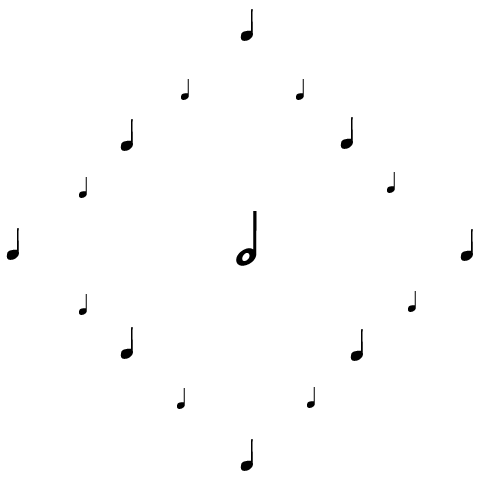
This design could be performed, but only just. Most musicians would consider
that a performance would be pointless and artistically meaningless. (Musicians
of the John Cage school might disagree.) How to perform it? The minims and
crotchets have a time relationship - the minim is twice the length of any
crotchet. The notes have no pitch level specified, but this is not an objection.
In musical scores, percussion instruments of indeterminate pitch are given
a notation using conventional notes. There are no indications of dynamics,
but we assume that the larger the note, the louder the sound. The performance
takes place, then, when the musician in the centre sings or plays a note louder
than the notes played by 8 other musicians, who play or sing notes louder
than the ones sung or played by a further 8 musicians. The notes played by
the musician in the centre is twice as long as the notes of the 16 others,
who sit or stand in the positions indicated by the plan.
It will be obvious that although the design is very poor, it has more importance than the musical content. The notes in this design act almost entirely as marks on paper, with only the most limited reference to musical meaning. Marks with no musical significance at all would convey the essentials of the design.
Although a few composers have spatial considerations in mind, these are never more than a subsidiary element. The work of the Polish composer Panufnik makes explicit appeal to spatial considerations. Antony Hopkins has a good discussion of one of Panufnik's works, 'Sinfonie di Sfere,' in 'Understanding Music.' He writes that the purpose which Panufnik had in mind was 'to write a work that would reflect in musical terms a sense of geometrical pattern and order...'
'Panufnik visualized the symphony as a sort of journey through ...three spheres, ascending through Sphere I to Sphere III...although music is normally (and properly) regarded as a temporal rather than a spatial art-form, he wanted to search for a new dimension of space through musical experience, a gradual penetration into what he describes as the 'soul' and the 'body' of the spheres, the 'soul' being the poetic content and the contemplative thought lying behind the notes, the 'body' being the 'chain of altering and recurrent feelings experienced through the framework of the musical material.''
As this explanation proceeds, I think it becomes clearer and clearer that Panufnik's purpose is close to 'Programme music,' music with an extra-musical context. The context is usually not at all a musical deduction from the piece and is sometimes wilful. Music is intrinsically non-programmatic, non-representational.
A performance of the Panufnik symphony takes place in time. It seems impossible to exclude time from music. I attended a recorded performance at an art gallery of 'Spem in allium' by Thomas Tallis. Loudspeakers were arranged in the gallery space, one speaker for each of the vocal performers. The performance, of course, was temporal as well as spatial.
Non-concrete poetry and music are both temporal. The linkages between them are close. Non-concrete poetry may not be performed but it's potentially performable. Concrete poetry is potentially performable. Is the same true of 'concrete poetry?' It's usually performable potentially, even when the poetry uses a level of fragmentation below the level of the individual word - letters, if not punctuation marks. An avant-garde performance can be imagined in which a speaker in the centre says simply the consonant 'c,' a speaker to the left says the vowel 'a' and a speaker to the right says the consonant 't.' The temporal order would be all important, of course. Successive deliveries from left to right would give the meaningful 'cat.' Simultaneous deliveries would give rise to something without meaning. This is not necessarily an objection. Poets who use unfragmented words and sentences are sometimes content to abandon meaning - as, sometimes, John Ashbery. Marjorie Perloff writes that he abandons meaning without achieving any 'special intensity.'
'Abandonment of meaning,' is not necessarily to abandon poetry. 'Special intensity' can be misinterpreted. Compare taste. There are people who can only appreciate very highly spiced food, food of 'special intensity,' ignoring a world of subtleties, understated notes.
I think there's a need for a new name for the language which is often used in 'concrete poetry,' although not just in 'concrete poetry.' This language doesn't have the sentence form of extended prose and doesn't have the distinctive organization of poetry. It's neither prose (P) nor poetry (P) and so I call it 'non-PP form.' More often than not, it's a language of fragments. These are none the worse for being fragments. Fragmentary language and fragmentariness in general interest me a very great deal. I think that they're crucial to an understanding of contemporary life, thought and art. Italo Calvino writes in his essay, 'Knowledge as Dust-cloud in Stendhal' '...fragmentariness concerns not only the past: even in the present something that is only glimpsed involuntarily can have even more powerful effect...' (Translation by Martin McLoughlin.) But my discussion here of fragmentariness has to be fragmentary.
One demand can be made of the fragments which are so often a part of 'concrete poetry.' This is for what I call semantic force and semantic significance, which involve the conveying not only of intense experience but significant experience which lacks obvious intensity. If all the the words of the words-designer are banal, without any semantic force or significance, then the design element may well be successful, but not the words. It's difficult to give semantic force or significance to any level of fragmentation below the level of the word. Empty space and human silence can be potent. It's more difficult to give semantic force or significance to fragments than to these. (But see my criticism of Eugen Gomringer's 'Schweigen' below.)
This site has a substantial section devoted to gardening. It includes the page design principles. There, I discuss things such as carpets which have a primary function but can be put to other uses: one-many design. An object with only one use is an example of one-one design. The first part refers to the object or structure, the second part to its possible functions. Carpets can be used not just for covering floors but for an outdoor use in gardens and allotments, suppressing weeds by light starvation. All the same, they have disadvantages for this use. They are heavy and cumbersome. There are problems of disposal. An object which is well adapted to its primary function may not be nearly so well adapted to a secondary function.
My 'dual-purpose' text is a successful example of one-many design, I think. One object, text, can have more than one function. It can be used to give information, or to convey things that are more than information. It can also be used for navigation, as on the page Poems. By clicking on the text, the user is taken to the top of the page. Similarly for images, which have a primary function, such as providing information or enjoyment and other possible functions, such as navigation in a Web page. By clicking on a poem in image form, the user is taken to the top of the page Poems.
What about letters and other objects of written communication? Their primary function is semantic, to convey information and things that are more than information in the distinctive setting of written communication. Using letters and other objects of written communication for visual design is problematic. Are they really multi-functional, capable of being one-many design elements?
The lines which are used in drawing are capable of almost endless variety in their length, shape, emphasis and placing. The lines which are letters and other objects of written communication are subject to severe {restriction}. The particular shapes of so many letters aren't particularly suited to general design. Many of them have projections, are bulbous. The shapes can be subjected to {modification} so that they are more suitable for the purposes of a particular design, but obviously the {modification} is subject to {restriction}. After a certain point, the letter becomes unrecognizable as the letter.
Some letters are well adapted to general purpose use as 'design marks' such as 'l' in the font Verdana. Sans-serif fonts are far better adapted than Serif fonts, but no matter what font is used, many other letters are far less suited as 'design marks,' such as a, b, d, e, g, h, k, y, z.
'z' is made up, in this font, of two horizontals and a diagonal. So, at the micro-level of this element, we have the visual statement of two horizontals and a diagonal. This may or may not be well integrated with the macro-level: let's say, a design which makes particular use of verticals. Similarly, 'p' and 'b' in Verdana are both made up of a radial component, approximately circular, and a straight-line vertical, not very prominent in this font. Again, integration into the macro-design may be successful or not. The macro-design may contrast ellipses with very pronounced verticals.
In most cases, general 'marks' are far easier and more straightforward to use than letters, unless letters are grouped to form a block or some other shape. Even then, the block or other shape is bound to have irregularities which will be obvious. But to state these difficulties isn't to present an overwhelming case. Overcoming difficulties - triumphing over difficulties - is part of the aesthetic challenge. In fact, there are many word-designs where these seemingly unpromising language-elements are put to very good use in the design.
My own work in concrete forms is essentially unfragmented. Even the poem Sailing from Belfast turns out to be completely performable in its fragmented form and the spoken fragmented poem is very similar to the spoken unfragmented poem, the poem in matrix form. There are obviously more pauses. The fragmented poem is a transform of the matrix form.
George Herbert used forms for his concrete poetry which don't differ from the forms of his non-concrete poetry. Now, the vast majority of concrete poems are examples of free poetry. It's mistaken, I think, to regard free form as the only possible choice for a contemporary poet. I generally use the term 'organizing principle' instead of form. I think that established organizing principles such as the sonnet and the rhymed couplet ('proximate lines linked by sound') can be used. There are completely new organizing principles which can also be used. I use organizing principles in my concrete poetry which I discuss on this page, such as unit form, strata form and axis form.
I'd stress {separation} between words with meaning and the visual design. My own practice leads me to think that the two elements come into being from very different compartments of the mind.
My own concrete poetry, like my poetry in general, is more often than not bleak, harrowing, discordant, but not at all a distorted view of life according to any adequate ((survey)), I think. But whenever I design, I turn again and again to serene and harmonious forms, not forms which are cluttered, agitated or discordant. One strong influence is architectural, including the architecture of the Italian Renaissance: forms such as the rounded arch, but the arch uncluttered by polychromatic decoration. In her superb 'Germany: architecture, interiors, landscape, gardens,' Christa von Richthofen writes, 'Sometimes German architects simply misunderstood Italian ideas, or used them only superficially. Often Renaissance decoration is only added to the façade of a building, and the brilliant clarity, the Italian feeling for rhythm and harmony, balance and restraint are lost.' 'Rhythm and harmony, balance and restraint' are what I aim at instinctively in design. Another influence has been the architecture and all the varied designs of the Bauhaus, These and their precursors represent, I think another renaissance, a renewal of purity of design after the dominance of cluttered design in Germany and in other countries, such as this country.
My appreciation, though, belongs to yet another compartment of the mind. The villages and towns of Alsace, anything but pure in their architecture, are amongst the ones I like very much - Colmar, Riquewihr, Kaysersberg and others, situated in France but German in style, with all the disregard for 'rhythm and harmony, balance and restraint.' Italian Renaissance churches have less appeal for me in general than Gothic and baroque churches. ('Appeal' here relates only to appearance, not function. Whether the design of the church has great appeal or very little, the function of the church is the same, disastrously misguided, based on a completely false view of reality, I think.) And I tend to appreciate very much designs in concrete poetry which have all kinds of 'picturesque irregularities,' like the layout of those Alsatian towns and villages.
Faulty 'linguistically innovative poetry'
More 'advanced' work isn't always the more artistically successful work. This is isolation of the more advanced and {substitution} ev-, unless the claim can be justified that a high degree of 'advancement' is necessary for artistic success. Poets have sometimes chosen to describe their work as 'linguistically innovative poetry,' for convenience regarded here as synonymous with 'L=A=N=G=U=A=G=E poetry, poetry with no use for such archaic and outworn forms rhymed poetry, or poetry with a readily grasped meaning. I'd stress the importance of factorization, of an adequate survey, a survey without undue {restriction}. The 'cutting-edge' language of 'linguistically innovative poetry' is only one factor. It shouldn't receive isolation.
'Linguistically innovative poetry' may also be:
rhythmically
inert poetry
emotionally backward poetry
politically innocent poetry (for poetry which has political content)
drab poetry
poetry with nothing to say
poetry as no more than technical exercise
routine 'linguistically innovative poetry'
poetry which misuses the word 'innovative'
Or it may be the genuine thing, linguistically innovative poetry which is far more than linguistically innovative.
Contemporary painting and work in other forms such as the installation and more recent experiments - the list of these is very long- are often produced by attention-seekers. They'll use whatever techniques and turn to whatever subjects give them the most attention. Works which are attractive and beautiful and works which are authentically ugly or uncompromising in their lack of concern for mere appearance don't usually give them enough attention or satisfy their craving. Attention matters more to these people even than money, although the money often follows. Decadent and diseased art is often very influential and very well rewarded.
The words 'decadent' and 'diseased' have to be rescued from misuse ('degenerate' is, though, almost certainly compromised for good, made unusable for good by its association with the 'Exhibition of Degenerate Art' of the Nazis.) A significant amount of non-concrete contemporary art is decadent or diseased, and this isn't because it's giving us new insights into decadent and diseased aspects of reality, which any adequate ((survey)) has to come to terms with.
In his book 'High Art Lite: British Art in the 1990's' Julian Stallabrass gives a superb and very acute analysis of the malaise of modern art. He discusses its decadence and disease but also the meagre inner life of the attention-seekers. For example, 'In different ways, Hirst, Hume, Emin and Turk - and they reflect high art lite as a whole - show that it is possible to continue making art without an interior life.' And, 'Hirst has become a cipher for the expression of average desires and fears, expressed consciously and without conflict, and finally reduced to the status of a corporate logo...'
Suzi Gablik, in her book 'Has Modernism Failed?' offers a very different but also interesting analysis, one that's equally pessimistic and, I think, realistic.
I don't discuss particular works here. I only record my appreciation for the many, many works of 'concrete poets' which are distinctive, interesting, remarkable examples of contemporary art and design. A great deal of 'concrete poetry' does renew our feeling for beauty and attractiveness. Where it's obviously not attractive or beautiful - it may be exploring very different aspects of reality - it has authenticity. The idealism very much in evidence in 'concrete poetry' is welcome and refreshing. The fact that 'concrete poetry' has very little market value compared with other forms of contemporary art in this case works to its advantage. The fact that, despite any claims to the contrary, it won't bring about social and political change is no argument against its artistic value. There's almost no decadent or diseased or dehumanizing 'concrete poetry. There are too many buildings in a fully contemporary style which are dehumanizing. Contemporaneity, like ingenuity, isn't enough. Of course, it's far easier for a small-scale form such as 'concrete poetry' than for a large housing development to avoid these faults.
Eugen Gomringer, Marcel Duchamp, Handel et al.
This isn't to deny that are 'concrete poems' which aren't diseased or inhuman but which aren't of much interest either. There are quite a number of them in existence, a fairly pointless existence. The poems which are self-referring but not much more than self-referring make up a significant proportion of these - the kind of poem entitled 'squashed' or something similar and which shows the letters as squashed, or the kind entitled 'snake' which has the word elongated and snake-like in appearance. There's certainly a place for playfulness but the playfulness of these poems gives, to me at least, only the mildest kind of pleasure and the kind of pleasure which is, let's say, far from inexhaustible. Even so, the context is important. Poems like these self-referring ones can appeal very much to children. They can have an important part in encouraging an early interest in poetry and design.
Eugen Gomringer's poem 'Schweigen' of 1954 (German for 'to keep silent' or 'stay silent') surely makes facile use of empty space and has an obviousness which gives it a 'fairly pointless existence.' To avoid the need to link to another site where the poem is displayed, I give the poem in my own lettering. The design is so simple that this gives everything essential to 'appreciating' the poem:
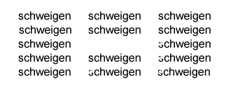
Eugen Gomringer, from Switzerland, is often regarded as one of the founders of concrete poetry, together with some Brazilian poets, Haroldo de Campos, Decio Pignatari and Augusto de Campos, but George Herbert was certainly using concrete form centuries before. Mary Ellen Solt in her fine 'Concrete Poetry: A World View,' claims that he 'achieves the simplicity and purity of concrete art.' Surely, simplicity and purity are achieved only by one element of the composite, the design element. The composite as a whole is simplistic and grossly unbalanced. An approximate musical equivalent for 'Schweigen' would be a note repeated at the same pitch and with the same dynamics, with a long rest within the musical texture. This would have simplicity and purity, but not at all inexhaustible simplicity and purity. Beethoven had very high regard for Handel and made the comment that Handel achieved the most wonderful effects 'by the simplest means.' The means, though simple, were not nearly as plain and simple as in this musical equivalent for 'Schweigen.' The miraculous effects he obtained by simple means would include, I think, the opening of 'Zadok the Priest' and the orchestral opening of the aria 'The people that walked in darkness' from 'The Messiah.' These have nothing like the obviousness of 'Schweigen.' These passages are part of a whole which is at a vastly more complex level than 'Schweigen.'
'Simplicity' should be subjected to {resolution}, to make clear degrees of simplicity. I'd claim that only 'the more complex simplicity' has artistic value. All-white canvases are too simple to have artistic value, despite any claims to 'complexifying' effects such as minute contrasts of tone and saturation, minute irregularities in the canvas.
Paul Muldoon has written two similar, larger but no more complex and no more impressive poems, both in his volume 'Hay.' One is 'A Half Door Near Cluny.' This is the line making up the top edge and bottom edge:
stablesstablesstablesstables
In the space inside the poem, unoccupied in 'Schweigen,' there's the word 'blé' (wheat.)
The other is 'The Plot.' This is the line making up the top edge and bottom edge:
alfalfalfalfalfalfa
In the space inside the poem there's the word 'alpha'.
Eugen Gomringer's poem can be acquitted of the charge brought against it by Marjorie Perloff (generally a good commentator) following Caroline Bayard, who concludes that 'the "fusion of expression and content" being advocated by the Concretists was an instance of what Umberto Eco had termed the "iconic fallacy" - the fallacy that "a sign has the same properties as its object and is simultaneously similar to, analogous to, and motivated by its object." At its most naïve "naturalizing" level, the iconic fallacy manifests itself, Bayard argues, in poems like Gomringer's Silencio, where the empty rectangle at the center of the composition is presented as the equivalent to the "silence" conveyed by the verbal sign.'
This
is a mistaken view of the use of theory, in this case semiotic theory. Theories,
like the 'rules' of musical fugue or sonata form, can't possibly dictate the
artistic success of a poem in this way. If a composer 'breaks the academic
rules' of fugue or sonata form to create an artistically successful work,
so much the worse for the rules. No poet or 'poet' should have to worry about
infringing a codification of semiotics, despite its vast importance in understanding
works of art, as of so much else. The linkage between 'Schweigen' as absence
of speech or other sound and empty space is valid:
[Scweigen] < > [empty space]
If John Donne had written concrete poetry like George Herbert, he could perhaps have made a concrete poem using as a starting point the words from his 'Nocturnal upon St. Lucy's Day, being the Shortest Day:' '...and I am re-begot/Of absence, darkness, death; things which are not' and using a black rectangle at the centre of the composition. This too would have been semiotically questionable.
Marcel Duchamp's 'Succession' is less simple than Schweigen but simplistic all the same and no more successful. 'Succession' has a kind of hole in the centre too (both holes not nearly as good as the holes in Henry Moore sculptures), but larger and not rectangular. The hole gains not the least aura of tantalizing suggestiveness or bleak presence (or rather absence) by the words which surround it, which include VOID and 'SILENCE...WORDS.' Most of the other words take the form of similar antitheses, which will please people who are very easily pleased, such as find real interest in the pairing of ' 'NIGHT...DAY,' 'PAST...NOW,' 'OFF...ON.'
Of course, avoidance of simplistic-simplicity is no guarantee of artistic success. Many of Apollinaire's 'Calligrammes,' are simplistically-simple, such as 'Il pleut' but many have a clutter which amounts to a lack of integration. I think of works such as 'La petite auto,' 'La mandoline l' oeuillet et le Bambon,' 'Madeline' and 'Venu de Dieuze.'
Nobody would use this Web site mainly for its links. The links I give aren't comprehensive for any section of the site. I write on the Links Page (which doesn't include links to concrete poetry sites): 'There are many outstanding sites which I appreciate very much, which I've studied carefully but which I haven't included ... as yet. ('Studied' is the word - very often, I've printed out many pages from the sites, so that I could give them my full attention later.)'
The site below gives a brief list of links, books and articles, which can be recommended. Its links include such large and prominent sites as those of The Sackner Archive of Concrete and Visual Poetry, UbuWeb and Michael P. Garofalo's site.(Although these sites are very useful they're not critical.)
http://www.philobiblon.com/isitabook/bibconcrete.html
C. John Holcombe's site 'Textetc' has a page on 'experimental poetry,' including concrete poetry, which is highly recommended (and many other highly recommended pages on many other topics). The page is critical. The author writes clearly and well, he shows detached intelligence and refuses to be easily impressed. It includes references and links: