A closer look at Large Page Design and the techniques I use
Putting rails on the page is quickly and easily done, once a 'basic rail' is available. The basic rail takes the form of a simple image, a rectangle something like 15 pixels wide - the exact width is a matter of preference - and a height which is sufficient to extend the length of the content of the page. The rail can be trimmed or increased in length before being placed on the page, or after being placed on the page. I use layers rather than tables for the layout of the page. A long, narrow layer is created on the page and the rail is inserted into the layer. A named anchor, the 'top anchor,' is inserted at the top of the page and the image, the rail, is linked to the anchor. All this takes is HTML (Hypertext Markup Language.)
The rails I use on all pages of the site are 'top rails,' taking the user to top of page when the user has clicked anywhere on the rail. Rails can be used for other purposes. They allow rapid movement in different directions, not only in a single direction, to top of page. So also do flights and flight-nodes. Flights can be used to cover short as well as long distances. Rails give the user reassurance, linking the place left with the place of arrival. Flight-guides give the same reassurance, in the form of a visible and continuous linkage, but don't indicate the presence of an active band like rail-guides.
Nodes can be used for various purposes. Flight nodes, as the name suggests, have the function of making flights available. Nodes can be used to give access to the information near to them, which is often in the form of information-clusters. Containers can be used to hold these clusters.
Information-clusters can consist of text, diagrams (with or without accompanying text), the separate parts of a large flow-chart and obviously very many other pieces of information. Alternatively, they may consist of things which are more than simply 'information,' such as thumbnails of photographs and short poems.
Clusters are separated by white space but they can be brought together - compacted - very easily by the user so that they can be seen more easily. Content on the page need not be fixed in position, although most large pages will have fixed content (which is easier to implement for the designer.)
Linkage-indicators may be either linkage-arrows or linkage-lines.
I refer to open and compact forms in information architecture in which there are different 'textures' on the screen. 'Compact' in this connection has the dictionary meaning of 'closely packed together' more often than 'neatly fitted into a restricted space,' although when the information clusters take the form of blocks of the same dimensions then they can be neatly fitted together.
Designers learn at an early stage in their design education the importance of white space.
Traditional type design suggests that judicious use of white space makes a page much more readable...Unfortunately, many Web designers tend to cram as much content into a screen as possible...
White space is very good. In fact, Web pages may need even more white space - as much as 40 - 60 percent white space on a page. However, some usability experts, notably Jared Spool (Spool 1999) suggest that white space actually may not improve page usability - and may even hinder it. This goes so far against conventional wisdom that it is very hard to believe. The probable answer is that the user can "cover more ground" quickly when looking through relatively dense text pages formatted for skimming." (Reference, Powell, op.cit. Page 471, 472)
The advantage of compacting is that it allows the user to remove white space and to move very quickly from open to compact view so that the advantages of both forms of display (free use of white space and restricted use of white space) are available.
There's a linkage here with the matrix form and fragmented form of a poem which is demonstrated on this site. The matrix form of the poem is compact - most poems are in matrix form, in continuous lines. When the matrix is fragmented, different layers are moved. In this case, they may stay near to each other but their relative position will alter, so that lines which are lower in the matrix become higher in the fragmented poem. The techniques used for defragmenting the poem and for compacting information clusters are exactly the same - the material is distributed on different layers, which are moved by means of a timeline.
Information on the page may also be continuous, not in the form of clusters, and not inside containers, but whatever form the information takes, it can easily be reached from a node.
Grid organization is suitable for the display of a very large number of information-types. It allows the user to navigate the Large Page with particular ease. Generally, labelling will be used rather than colour-coding or tonality coding (discussed below) to provide visual cues as to position in the page. Labelling doesn't have the immediacy of colour-coding or perspective coding - it takes a moment to read the label - but it does have obvious advantages in the systematic provision of information.
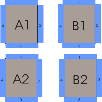
Each container can be labelled and identified by the convention usually used in spreadsheets: a letter for the column and a number for the row. The letter identifies the container-column. So, container B4 is in container-column B and row 4. If the information isn't in the form of contained clusters, then the same convention can still be used. The Large Page is divided into Large Cells and letters and numbers are used to identify a cell on the page. So, cell A1 would be at the top left hand corner of the page. It's common for the index of an atlas or road map to refer to locations on a page in this way.
Rail-nodes are used to access columns B, C, D and E. The containers in row 1 are easily accessible. To go to the container in the row below, row 2, simply click on the blue button. If you've reached a container in, let's say, row 3 and you want to get to the top of the page, where the nodes can be found, you use the visible rail, the blue band, at the left of each container-column. I'm sure you'll find that this system is very easy to use.
Another way of moving from one container to another is by means of active borders. This diagram shows four containers, labelled according to spreadsheet conventions: containers A1 and A2 in column A, containers B1 and B2 in column B. Each container has four borders, labelled 1, 2, 3, 4 in the diagram below. To go from container A1 to container B1, the user would simply click on the border of A1 nearest to B1: border 2. To go from container A1 to the container below, A2, the user would simply click on the border nearest to it, that is, border 3 of A1. (The borders are obviously not active in this reduced-scale diagram. Four borders are shown for each container, even though movements are not possible in every direction, for example, from A1 upwards.) Whatever the contents of the container, text or graphic, clicking on the container would take you back to page-home. If the borders are regarded as too obtrusive, they can easily be made invisible, the same colour as the page.
The containers shown on this page are dispersed containers: each container is surrounded by quite extensive white space. Cell-containers or simply cells, on the other hand, are adjoining, as in the cells of a spreadsheet.
A design which makes use of cell-containers is probably the easiest of all designs to implement, obviously a very important consideration.
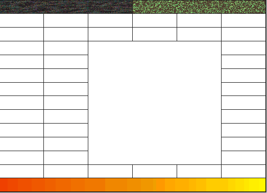
This shows just a few cell-containers (the reason for the coloured strips is explained later).
Cell-containers can be used very easily to create an almost instant design, and flight-nodes and invisible rails can be added easily for navigation. The layout of the Large Page is completely straightforward, and there's no particular need to create a page-plan. A spreadsheet can be used to create the cells. Spreadsheets, of course, are very versatile tools, and the cells can contain the most varied data - accounts, scientific and technological information, everyday lists, and images. They can function as databases, allowing data to be sorted in various ways. Many spreadsheet users only use cells of the dimensions which are provided, but cells can be merged to make much larger cells, suitable for the display of more extensive content.
The table above shows empty cell-containers which can be filled with information, and includes one larger cell-container produced by merging. The table as a whole is small but of course there's no difficulty in producing very large tables to occupy the Large Page.
In a large table with content of a fairly uniform type, it's important to give positional information - otherwise one part can look very similar to another part and lack distinctiveness. This positional information can be provided by means of position-strips. A small table like the one above wouldn't need them - the strips at the upper and lower edges are there simply to illustrate their use.
Position-strips of the most varied types can be used - uniform fills, texture and pattern fills and gradients. Strips can by polychrome or monochrome, thin or broad, only at the top of the page or at frequent intervals across the width of the page. Strips are functional but they may also be useful in enlivening the display of information. The example above shows strips with two different textures at the top of the table and a colour-gradient strip below the table, both broad.
An obvious extension of the technique is to combine position-strips with visible rails, so that one element has two functions: a means of travelling to a destination (the rail) and a means of showing the position of the user (the position-strip).
It would also be possible to give positional cues by using different backgrounds for the information in different parts of the table - for example the textured backgrounds which are in common use on Web-sites. Myself, I favour a plain white background. With black text, this gives (almost) maximum readability but the use of textured backgrounds is in accordance with the principle that decorative techniques can become functional techniques.
Despite their advantages, I would expect there to be minimal use of 'decorative-functional techniques' in very formal settings, such as research papers in science and engineering, in academic works in general, but it's quite possible that they could gain wide acceptance in the future.
The most useful form of organization is grid organization, but some content is better suited to radial organization. In radial organization, page-home is at the centre. Colour-coding isn't essential in radial organization any more than in rectangular organization, but colour coding can be used, and I refer to the colour-coded pattern as a chromatogram (colour-pattern). (Large pages have to be rectangular, but sub-pages, inscribed in a Large Page, may be circular, can be circular if need be - or if preferred.) Colour-coding helps to prevent the user from feeling lost, a prime objective in the navigation of a Large Page, as in the navigation of complete sites.
Chromatograms provide ways of providing useful visual information to the user about general location in the Large Page.
The use of gradients in chromatograms gives further visual information to the user: directional information. A gradual transition from one colour hue to another, or from one tone to another (from 'more faint' to 'less faint,' perhaps) may show users that they are getting nearer to page-home.
The disadvantage of chromatograms, of course, is to do with accessibility - some users are 'colour-blind.' However, there are monochrome equivalents of chromatograms, and differences between bands and gradients can be shown perfectly easily by using tonal values without colour: black, white and shades of grey.
Page-home in Large Page Design has a linkage with the home page of a multiple page site and obviously in a site which uses many pages as well as one or more Large Pages there will still be a home page. Page-home can be used in Long Page Design and Wide Page Design as well as in Large Page Design. In these cases, the information it gives about using the page isn't extensive.
Page-home is the starting point for journeys around the Large Page. Psychologically, page-home will be a place of security and a familiar sight after travelling around the Large Page, but a place which is very easy to leave and which encourages travel.
Page-home may contain these components:
-
A small information-board, giving basic information about the page.
-
A contents-table or index, listing the information-clusters or other sources of information on the page. This may be described as a 'List of Flight Destinations), as on this page.
And sometimes one or more of these:
-
A page-plan, an aid to navigating the page (not always necessary.)
-
A network-plan (for complex pages, if thought necessary).
-
A viewer, for consulting information-clusters. To use space more economically, the page-plan can be stored in the viewer until an information-cluster is put into the viewer. This isn't applicable if content is fixed on the page.
-
A control-panel for different actions, for example, compacting, the removal of white space between information-clusters.
A network-plan gives the information needed for the application of graph theory to the page. Graph theory need not concern most designers and users, but it can be useful one in the case of complex Large Pages. For the application of graph theory, the difference between flight-nodes and rail-nodes isn't important. The term 'node' is retained, and supplemented by other terms and concepts in graph theory - edges, directed edges, Minimum Spanning Tree, loops, and so on.
You arrive in a new place and you have the feeling that "you could be anywhere." Alternatively, you may arrive in a new place and the region is a distinct one. It may be distinctive in building materials, architecture, vegetation, temperature, accent or language.
In the same way, regions are areas of the Large Page which are contrasted with other regions in one or more ways. Regions may be formed of sub-regions.
Typography is a very important way of establishing regional differences. Large Page Design is likely to give typographers more opportunities than other kinds of Web design, for the most part. In the usual multi-page site, the need is for a consistent typographic style from page to page and on each page the use of very few fonts. Large Pages will often benefit from the use of quite a number of contrasting fonts to establish regional differences. In this large page, sub-region 1b, the Glossary of terms I use in Large Page Design, is distinguished from sub-region 1a by typography.
In many Large Pages, particularly those with academic content, typographic differences are all that is required, except, perhaps, for subdued colour coding. In other contexts, accentuated differences in colour and/or texture may be appropriate, and these are described further in the section above, on grid organization.
People with an interest in non-functional design can take this design principle much further and create many variants. This is just one example: Web design can be linked with garden design to accentuate regional differences in the Large Page. Regions of the Large Page can be warm or cool, with drifts of colour, there can be restful and tranquil regions contrasted with busier and more animated regions. The Web Page may even change through the year, colours being replaced in the various regions.
You can quickly get a 'bird's eye view' of the page, what I call aerial view by using the zoom facility available in all the most commonly used browsers - zooming out rather than zooming in. You can appreciate very easily the organization of a significant part of the Large Page, and then return to what I call 'ground view,' which is used for reading this text. There's a real fascination, I think, in being able to switch between aerial view and ground view of the page.
In aerial view, all the links are 'active' - clicking on them produces the expected result. The only disadvantage is, of course, that the components are smaller in aerial view and more difficult to find and click. The use of expanses or expanse-buttons removes any residual difficulty. Expanses, as the name suggests, are buttons which are not small, like the buttons almost universally used in Web-sites at the moment or long and thin like rail-buttons, but extensive. They can be used very easily in aerial view. Flight-nodes are easier to find and use than link text and are useful in navigating in aerial view.
Zooming makes a page-plan unnecessary for many pages, particularly when straightforward methods of organizing the page are used, such as grid organization. Designers can produce versions of page-plans very easily by zooming out of the page and copying and pasting the screen view.
A common view: web page graphics that exceed the width dimension of the most common display screens look amateurish and will inconvenience many readers by forcing them to scroll both horizontally and vertically to see the full page layout. It's bad enough to have to scroll in one (vertical) direction; having to scroll in two directions is almost intolerable.
How, then, can Large Pages be justified as a conscious design choice? The answer is: very easily. Large-scale content will often make the Large Page by far the best and most convenient choice. If horizontal and vertical scrolling were the only means for navigation then the best and choice would have considerable disadvantages but the methods I've already mentioned and will discuss in more detail are likely to make moving around the page easy for users - as well as interesting and enjoyable. Large Page Design, then, is about the methods needed to navigate in extensive content displayed as a single page which is wide as well as deep.
These are just a very few examples of large-scale content from academic and non-academic areas which may well make Large Page Design the method of choice. In each of them, the content to be displayed is inherently wide, and to truncate it and place the content on a Narrow Page instead of a Wide Page will usually not do justice to the content.
1) The architecture of a web site is often inherently broad as well as long. A modified linear site may be very wide. A wide hierarchy is based on breadth of choices. A grid is a "linear structure that presents both a horizontal and a vertical relationship between items." (Thomas A. Powell, 'Web Design,' Second Edition, Page 170.) These architectures are chosen because the content demands it. Site maps are useful for some of the same reasons that geographical maps are useful. The site maps for architectures such as these will be naturally large.
2) Very large diagrams in Biology and Medicine. Examples include many charts of metabolic pathways, Genetics diagrams which give information about genomes and diagrams of food webs in ecological studies.
3) Diagrams showing large and complex circuits in electrical and electronic engineering and complex pipework in engineering.
4) Accounting information of any size. Accounts are often inherently wide and long. This information may be in the form of spreadsheet data.
5) Flow charts and diagrams which are
concerned with the structure or activities of medium-sized and large organizations.
6) A wide display may be chosen even if the content doesn't make it very desirable. Poems on a site can be displayed in rows and columns, rather than in a narrow vertical band.
Even when the content doesn't make Large Page Design the obvious choice, using a large page rather than a long page may well offer advantages Supposing a page has 25 screenfulls of information and is displayed as a Long Page: vertical but no horizontal scrolling. We show the page by means of a scaled diagram which is 25 units long. The furthest distance which has to be traversed on this diagram is 25 units If the same content is displayed by means of a single Wide Page which is 5 screenfulls wide by 5 screenfulls long, then the furthest distance is a diagonal, for example from top left to lower right, and is just over 7 units. In other words, 'travelling distances' are much shorter on the Large Page than on the Long Page. Psychologically, all the content is likely to seem conveniently to hand, well within reach.
Whether the Long Page or the Large Page is the better way of displaying content depends very much on the content. Extensive text in continuous prose may be better suited to the Long Page, but this need not be the automatic choice.
-
Designers generally use Long Pages for extensive content but Wide Pages and Large Pages (which are wide as well as long) are often more suitable for the purpose. Extensive information may well be distorted if Large Page Design isn't used.
-
The claim that horizontal scrolling as well as vertical scrolling makes Large Pages difficult to use isn't so. There are innovations which eliminate the need for scrolling and which solve the problem, such as:
-
The rail. The rail at the left, the vertical blue band, is used for vertical movement, to reach the top of the page, but rails can also be used for horizontal movement or for movement in any direction. They also have many other uses besides movement on the page.
-
Expanses or expanse buttons can also be used for movement on the page or for other actions. Expanses are not implemented on this page but are implemented on some other pages of this site. By clicking on the text at any point, the user is taken to the top of the page.
-
Flights can also be used for movement. Clicking on a flight button takes the user to a near or distant location.
-
Taking the user to a new location is not the only way of finding information on the page. Instead of the user being taken to the information, the information can be brought from a distant location to the user. It can be inserted into a viewer.
-
Nodes allow ready access to the information near to them. Information may be in 'containers,' generally rectangular and often arranged in the form of a grid. The containers may be touching, like the cells of a spreadsheet, or separated. Alternatively, the information may not be displayed in containers.
-
Zooming allows the user to see the whole of the Large Page, or a great deal of the Large Page. This is 'aerial view' contrasted with the usual way of using a page, 'ground view.'
-
'Information' which is presented by Large Page Design may obviously be of the most varied kinds and not purely factual. To give just a few examples, poems or photographs as well as scientific, technological and other academic content. Large Page Design can give aesthetic and emotional experiences, such as the experience of travelling on the Large Page, taking the user into new, varied, often remote regions, away from the security of page-home, the starting point for journeys on the Large Page.
I see Large Page Design as an instance of diversification (please see the General Glossary for an explanation of this term.)
To call an artist 'a miniaturist' is usually no compliment. Web designers have concentrated their attention on the viewing area, the screen, and ignored wider vistas. Screens have increased in size but the viewing area still cramps the designer, so often. Large Page Design opens up new possibilities. When we're inside a large and magnificent building, we can only see part of it, but then we reach another view-point and new vistas open up. So, in a Large Page, what we see on the screen is what we can see from one view-point, and then we move on to another. Not all notable works of architecture are very large, but an architect with any ambitions doesn't design very small buildings, only miniatures.
And so for information architecture: there's the need for spaciousness to provide contrast, and the need for extensive structure to accommodate extensive content, content that is wide as well as deep - and so much contemporary content is very extensive in this sense.
Imagine settlers on the edge of a very large island. They cultivate one edge, not much more. They haven't explored the interior - walking is slow and tiring. Designers have been using the left edge of the page almost exclusively for a long time. (This is not to criticize the competence or vision of designers in the least.) There are ways of exploring the interior without using tedious scrolling to any great extent, much faster and easier ways. Why not use them?
I form a linkage between two sharply contrasted spheres. The American pioneers headed West. In his essay 'Walking,' Henry David Thoreau wrote of the West "The future lies that way to me...And that way the nation is moving, aad I may say that mankind progress from east to west...we go westward as into the future, with a spirit of enterprise and adventure." But in Web design, there is no alternative to the move in the opposite direction: Eastwards, away from the security of the left edge of the page.
Glossary of terms I use in Large Page Design
The glossary needs to be used in conjunction with the fuller explanations above. The terminology I've devised makes extensive use of compound terms, often hyphenated, such as top-rail, rail-guide, rail-movement, rail-node. I very much hope that the 'vocabulary building' of Large Page Design is one of its incidental attractions. Throughout this glossary, I refer to 'information' but this is to be understood very broadly. It may include scientific, technological, legal, financial and organizational information - information, in fact, from every academic field - as well as information used in everyday life, but it may also include matters which are not only to do with information, such as poetry and images with aesthetic impact. I include a few terms which concern developments I'm working on or have worked on but which are not discussed in this page.
Active Refers to a structure such as a rail which brings about movement or some other action if clicked or otherwise activated by the mouse. A rail-guide simply shows the position of an invisible rail and is inactive.
Active border Borders surrounding containers, used for moving from container to container very quickly and easily. To get to the next cell, the user simply clicks on the border nearest to this cell.
Aerial view A zoomed view of the Large Page - as if from a height - which allows some, most or all of the Large Page to be seen at once and certainly far more than in ground view. The user can navigate within the Large Page or carry out other actions very easily before returning to ground view to read the page or make other use of it. Internet Explorer 7includes the zooming facility needed to use aerial view. The browser Opera includes useful but more limited zooming facilities.
Cell-containers Containers for the temporary or permanent holding of information which are touching rather than separated by white space. There is a linkage with the cells of a spreadsheet. Cell-containers may vary widely in size and may be resizeable.
Chromatogram A striking position-indicator and/or movement-indicator used in radial organization which uses colour coding. For occasional use.
Compacting Removal of the white space between containers or information clusters. When information is compacted, more information is visible on the screen. Uncompacted information uses white space as a separator, with the accepted benefits of white space in design.
Container Information on the large page may be uncontained information or contained information. The containers for contained information are 'boxes,' often rectangular, in which the information is placed either permanently or temporarily - the containers may be emptied or the information may be replaced with other information. Containers may be colour-coded or otherwise distinguished from other containers.
Container-column In grid organization, containers which are arranged in columns. Compare 'container-rows.' In the page-plan for this large page, container-columns are shown, not the separate containers which are arranged in the columns, a more convenient representation. A container-column may be made up of just one container, as in the case of the container holding the diagram of the Krebs cycle. This eliminates the need for separate symbols for container-columns and single containers.
Container-contents Information to be found in the containers, for example the Krebs Cycle on this page.
Contents-table Part of page-home. This is a list of information such as container-contents to be found on the Large Page.
Control-panel Part of page-home. This can be used for many different operations, for example, compacting.
Dispersed containers Containers which, unlike cell-containers, are separated by white space.
Dual-purpose button Web sites are made up of text and, often, images. Apart from their primary use in providing information, and so on, the text and images can also be used to bring about events, such as reaching the top of the page. In a long page, it makes no sense at all to provide top-buttons, since the user can simply click on the existing text or image to reach the top of the page. The text or image acts as a dual-purpose button. It's necessary to make the text or image a button which is not at all obvious: in the case of text, it will not be blue and underlined, for example. The General Glossary of this site uses all its text (after the list of entries) as a dual-purpose button. Since the dual-purpose button is large (it can easily be seen in aerial view) it forms an expanse.
Expanse or expanse-button A button which is extensive, in shape often, but not always, rectangular. I generally use text - a text-button - rather than an image to bring about the link. Invisible or visible text may be used. In the case of visible text, the text is dual-purpose: the text provides information as well as being used for the link. If images are used, they too may be dual-purpose: the image provides information (or an aesthetic experience, etc) as well as being used for the link. An expanse-button has the advantage that it can be readily seen in aerial view. An event such as choosing a container for view or going to page-home can then be achieved before returning to ground view. The General Glossary of this site demonstrates use of an expanse-button. To view it, click on the Glossary button at the top left of this page.
Expansive model of information architecture. Compare one floor of a very large department store (this is only an analogy - I very much favour small-scale retailing for most purposes.) The retail area is large and continuous. Not many of the items for sale can be seen in detail, but you can see the general layout easily. Large Page Design presents information in a similar way. In aerial (zoomed) view, the general layout can be seen easily. Existing methods of Web design for presenting large quantities of information can be compared with a different method of retailing, and one which is much less convenient: as if the same items were in a number of small rooms, and many of them in cupboards.
Fixed content Content which can't be moved within the page, for example by bringing it to a viewer from its original location, or by compacting. Much easier to implement than movable content.
Flight One of the two main forms of movement in Large Page Design.. The other is the rail. In the case of flight-movement, there is no continuous active band linking the departure-node and the arrival-node. Flight-movements may be short as well as long and are not quicker than rail-movements - both are almost instantaneous.
Flight-guide A non-active line which shows a flight-movement which is possible on the Large Page, linking flight-nodes. The flight-guide is a form of linkage-indicator.
Flight-node The departure-node or arrival-node for a flight-movement. The equivalent, for journeys in the world, of an airport. (There is linkage between flight-node and airport.)
Flight-rail Clicking on a rail which is a flight-rail (or some other action which activates the rail) takes the user to a flight-node rather than a rail-node.
Grid-organization The arrangement of containers (or information-clusters if these have similar sizes and shapes) in rows and columns, as in a table. The regularity of grid-organization may well make the provision of a detailed page-plan unnecessary.
Ground view The unzoomed view of the page. You're reading this information in ground view. Compare aerial view.
Information-board Part of page-home. This contains useful information about navigating and using the Large Page.
Information-cluster Information which is is in one place rather than diffuse or dispersed but not inside a container. Nodes allow ready access to these information-clusters and ready movement from these clusters to other parts of the Large Page.
Invisible rail A rail which is not visible on screen, although its position may be indicated by a very thin rail-guide.
Levels The view you have of this page is at ground level. You can obtain a panoramic view of ground level (if you have zooming facilities) by taking an aerial view. If you click on a blue underlined link, for example to take you from the top of this page to the glossary, you are still at ground level: this is simply a movement within the page. On the other hand, a blue, underlined link which took you to another page, leaving this page behind, would take you to level 1 and a similar link from level 1 would take you to level 2.
Movement A 'journey' within the Large Page. The designer of the Large Page who is not purely concerned with information will often be able to give to these movements the feeling of anticipation, excitement, eventfulness, interest and relief of journeys in the world. Movements take the user into different regions, often strikingly different regions, of the Large Page. The designer who is entirely concerned with information will be concerned to make these movements as efficient as possible, so that information can be consulted quickly and easily. For very large pages, graph theory may be useful for this purpose. Movements within the Large Page are generally very fast, using rail-movements and flight-movements, so that the user can navigate the page with great ease, although much slow movements are also possible.
Movement-indicator A device which gives an indication to the user about movement in the Large Page, generally an indication which is grasped very easily or even subconsciously, for example, changes in colour or tonality, for example from black through various shades of grey to white. The gradient gives the user directional information.
Network-plan Part of page-home. A plan of the Large Page for the application of graph theory, showing nodes, edges etc.
Node The departure point or arrival point for movements in the Large Page. So, there are departure-nodes and arrival-nodes. In most Large Pages, no information will be far from a node, so that there is ready access to all the information on the Large Page.
Page-home The starting point for movements (journeys) around the Large Page, just as the home page is often the starting point for navigating the pages of a multi-page site. Page-home may also contain aids for navigating the Large Page and information about using the Large Page, such as a page-plan, a network-plan, a contents-table, a control-panel and an information-board. For long pages and wide pages, a simpler page-home is sufficient, containing enough information to use the page effectively, for example instructions about the use of a text-button or rail. In this case, I simply give a paragraph at the top of the page in bold print. Most pages on this site include page-home, giving information about the use of dual-purpose text or the vertical rail.
Page-plan A plan of the Large Page which uses page-symbols to indicate the components of the Large Page as an aid to navigating and using the Large Page. It would be desirable to use a standard symbol-set and a standard colour-set. I use page-symbols and page-colours consistently on this large page. For example, visible rails are light blue (hexadecimal #66 99 FF, RGB 102 153 255.) Page-plans will be very diverse in kind. Some may have similarities with the plan of a transportation network such as the London Underground.
Perspective organization A striking position-indicator and movement-indicator which uses linear perspective or aerial perspective. For occasional use.
Position-indicator A device which gives an indication to the user about position in the Large Page, generally an indication which is grasped very easily or even subconsciously, for example, simple colour-coding: a user may move from a yellow region of the Large Page to a blue region.
Radial organization The arrangement of containers or information-clusters in a circular pattern (for example, in concentric circles.) The regularity of radial organization may well make the provision of a detailed page-plan unnecessary.
Rail or rail-button A button in the form of an active long, thin band, which may be either visible or invisible. Clicking on the rail, or some other action, brings about movement or some other event, such as access to a contents-table. The rail is a form of linkage-indicator.
Rail-guide A very thin line which indicates to the user the position of an invisible rail. The use of rail-guides and invisible rails may be preferred to the use of visible rails because they are less obtrusive. For other uses, visible rails may be preferred. The rail-guide is a form of linkage-indicator.
Rail-node The departure-node or arrival-node for a rail-movement. The equivalent, for journeys in the world, of a station. (There is linkage betwen rail-node and railway station.)
Region An area of the Large Page which is distinguished from other areas. The regions may, for example, contain different information-classes. The region may be distinguished from other regions by various means, for example, by typographical means.
Remoteness Distance from page-home.
Section rail A rail used to go to the top of a section of the page, so that the user can click on an underlined link in this section. The page on concrete poetry has an example of a section rail.
Slow movements Movements within the Large Page are generally very fast but it is possible to implement leisurely tours of different areas of the Large Page by automatic scrolling. These are slow movements (compare 'slow food' and 'slow cities,' both of them movements which began in Italy.)
Text-button The use of text in rails or expanses to bring about events such as links. (Compare with the established use of short sections of text, often underlined and in blue, for links.) A text-button may be visible or invisible. If visible, it is generally dual-purpose, to give information as well as to bring about events such as links. If invisible, the colour of the text will have been altered so that the text is indistinguishable from the background. The General Glossary of this site uses a very large text-button (an expanse) to take the user to the top of the long page.
Text-graphic The use of text instead of a graphic in a rail or expanse.
Top-rail A vertical rail which takes the user to the top of the page. Very useful for the long, thin pages so common in 'traditional' Web design as well as in Large Page Design. This has great advantages over other ways of reaching the top of the page, such as placing link text at intervals down the page - 'to go to top of page click here.' The link text detracts from the design.
 This is an example of a flight-node.
A Obviously, flight-nodes of many, many
different forms can be used. Flight-nodes can be active - clicking
on it takes the user to a location - or inactive. In this case, it draws attention
to a link, often an underlined link. Larger flight-nodes can be used. These
are large enough to be easily seen when the page is in aerial view.
This is an example of a flight-node.
A Obviously, flight-nodes of many, many
different forms can be used. Flight-nodes can be active - clicking
on it takes the user to a location - or inactive. In this case, it draws attention
to a link, often an underlined link. Larger flight-nodes can be used. These
are large enough to be easily seen when the page is in aerial view.